Joanna Bird gives a guided tour of the current exhibition Autoritatto. Film by Alex J. Wright
Cathedral by Nico Conti
‘The artists in Autoritratto range across the whole spectrum of craft practice, from the most historically rooted to the most adventurous, reflecting and refracting many different selves . . .
Bird has made an extremely provocative opportunity out of a most challenging set of circumstances: inviting this group of artists to reflect on objecthood and identity, and the way these values cross the threshold from the virtual to the actual . . .
“THIS ABOVE ALL: TO THINE OWN SELF BE TRUE.” It is one of Shakespeare’s most well-known lines, and rightly takes pride of place in the present exhibition of handcrafted self-portraits, executed by the masterful hand of calligrapher Charmian Mocatta. There’s just one problem: as advice goes, it’s remarkably difficult to follow.’
Glenn Adamson, Senior Scholar, Yale Center for British Art
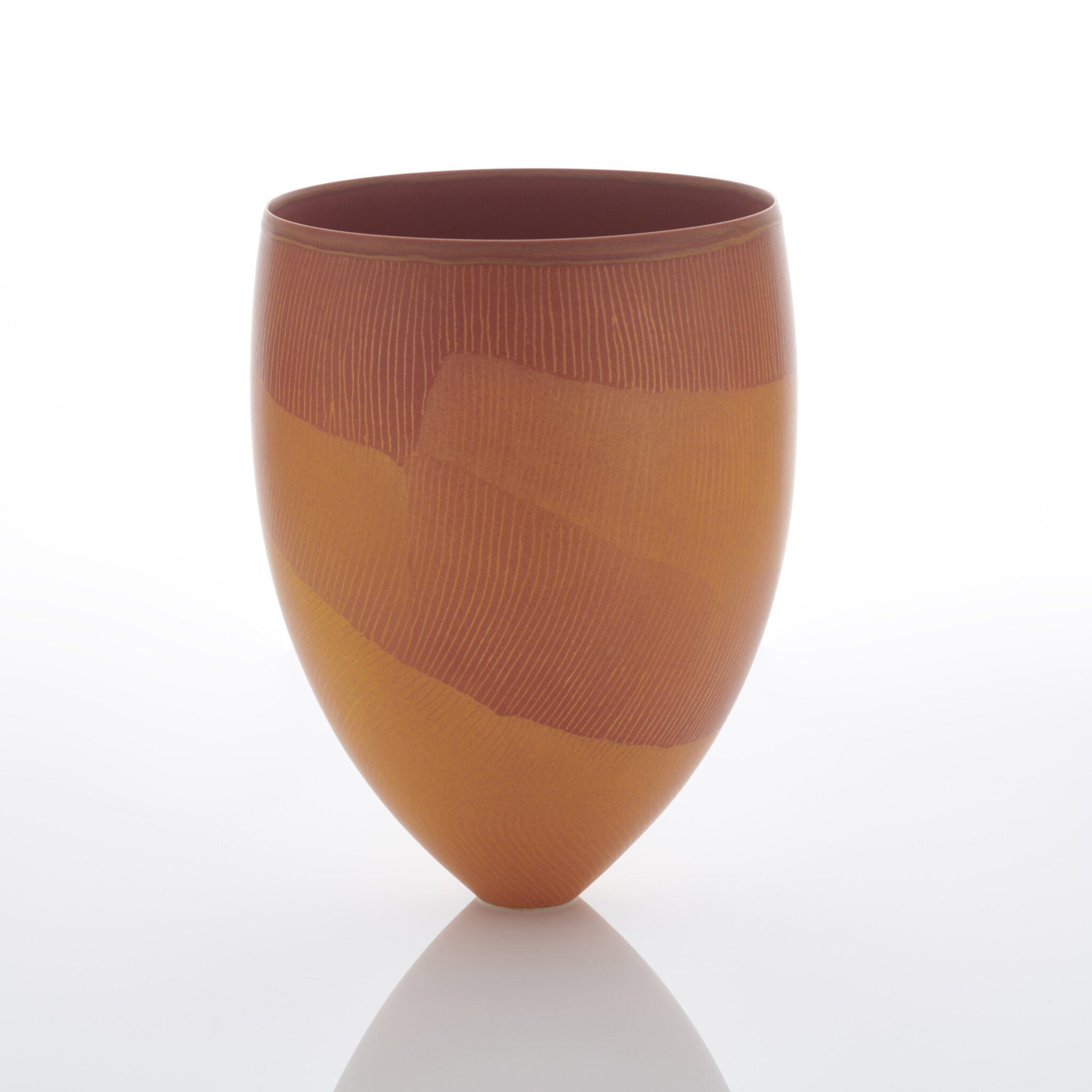
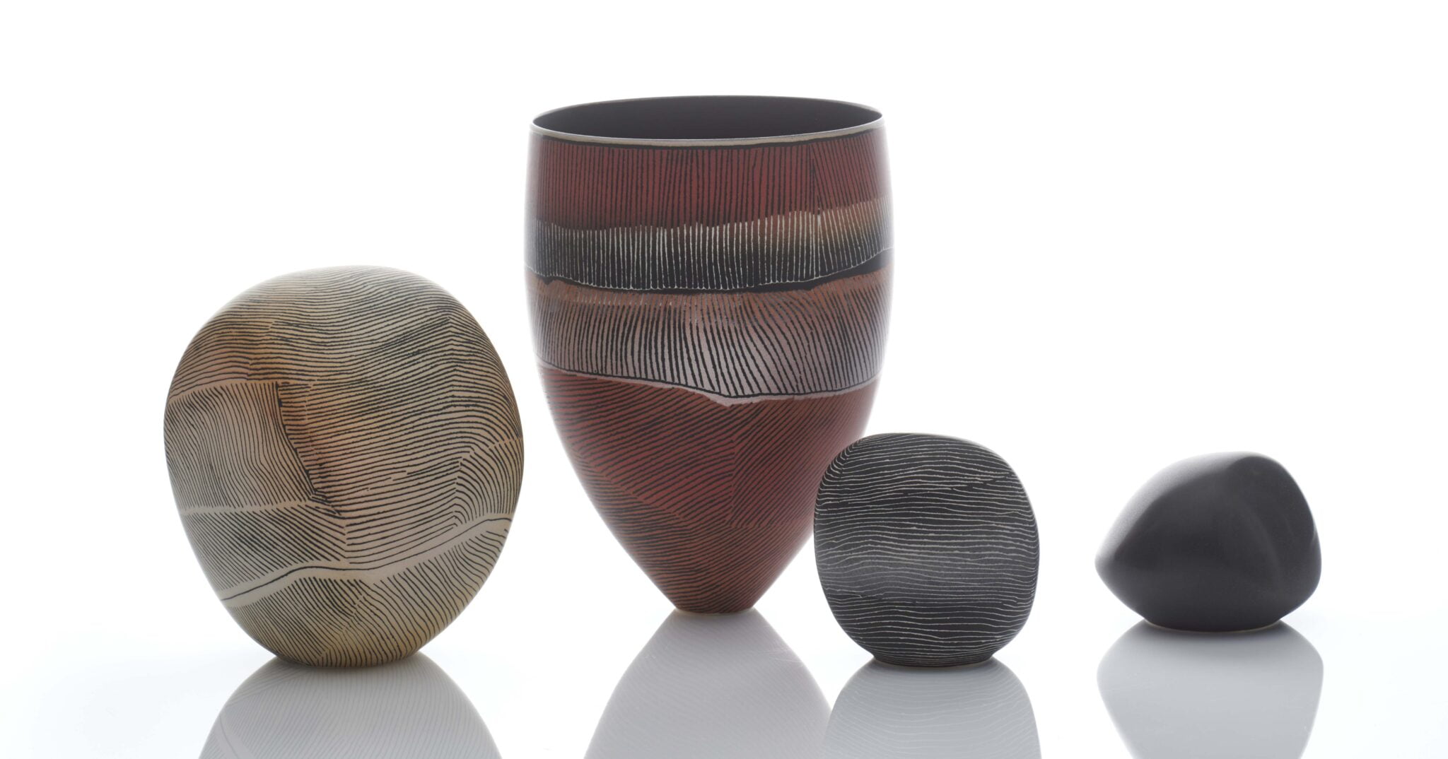
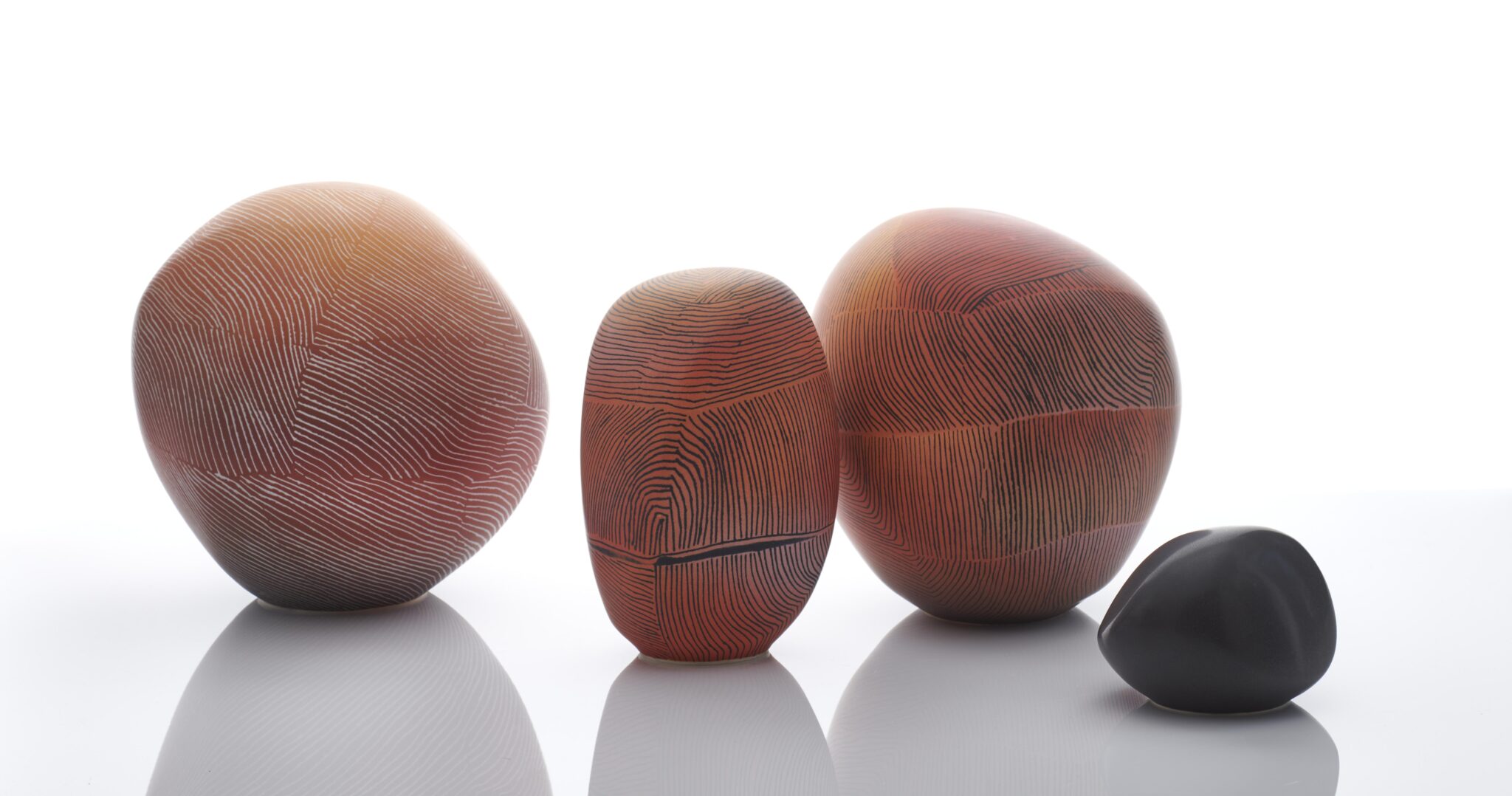
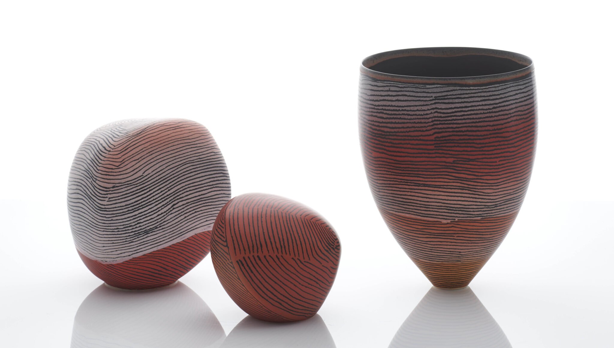
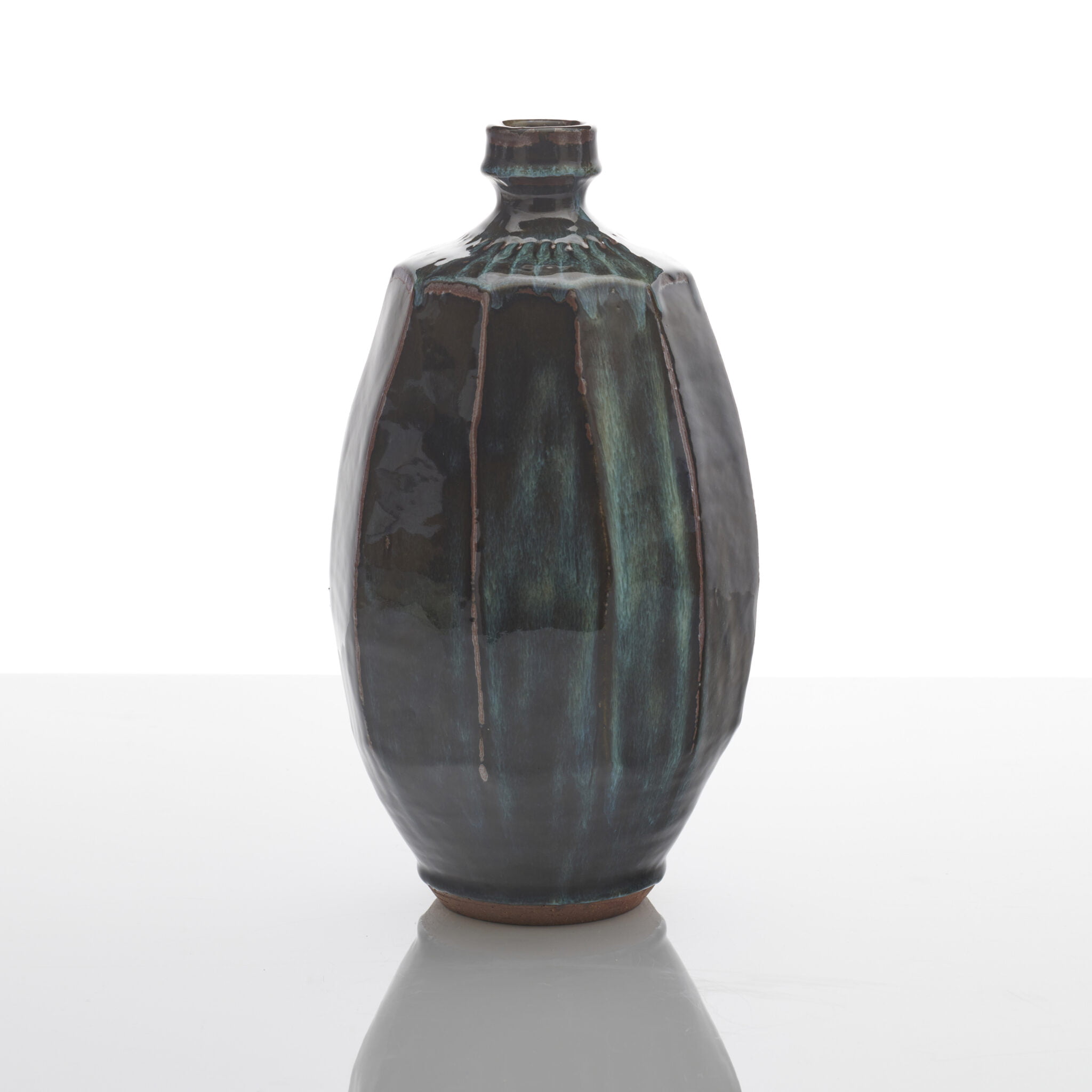
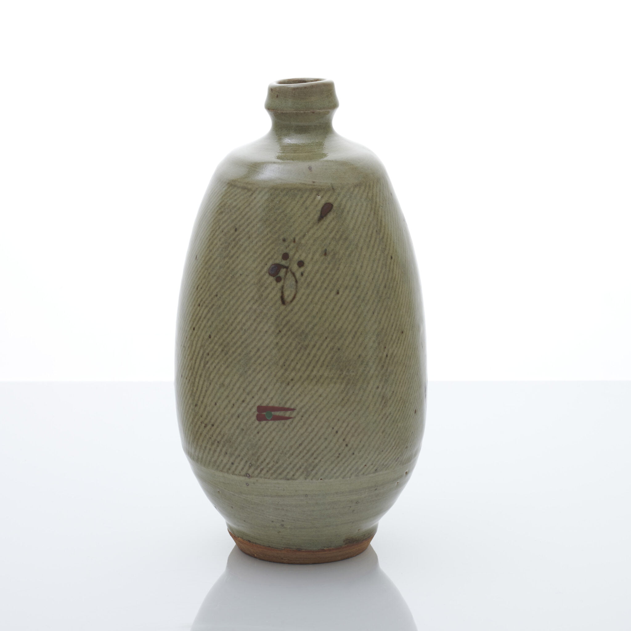
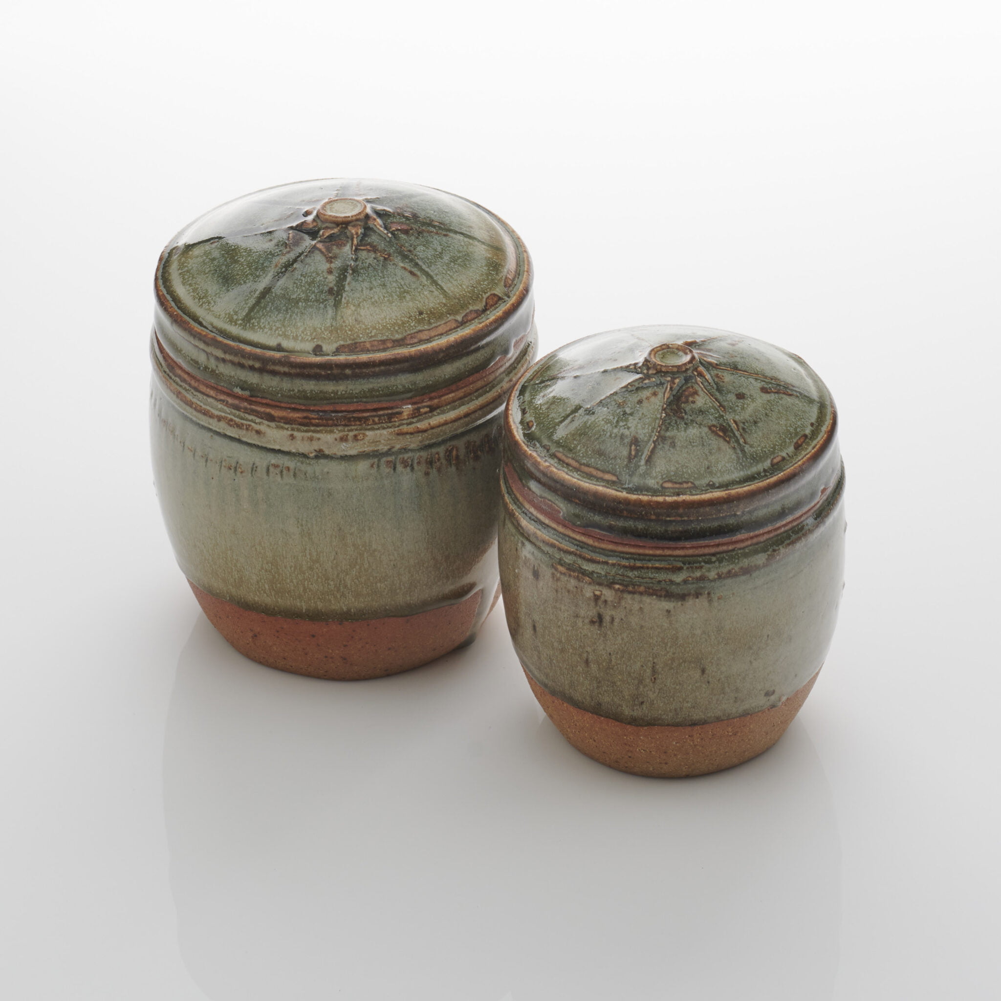
For me, my portrait is etched into the Australian landscape, as the landscape is indelibly printed on my psyche. I have observed the dramatic terrain which has never failed to give me ideas and has been a constant challenge all my life.
My most recent research has been rewarding – studying in depth the colours and forms of the Devil’s Marbles, a geological phenomenon of balanced rocks in Warumungu, in the Northern Territories. The heightened relief of the rocks in changing light during the day, and coalescing in the evening light, have excited me. I have strived to capture these extraordinary colours in my glazes – and this has involved a huge amount of experimentation. The pieces for Autoritratto are chosen from this body of recent work.
The forms are as important as the glazes of course; they throw shadows and convey the vastness and cinematic scope of the Australian landscape. The Tanami Desert and the topography of Western Australia are my home, my garden, my morning, my evening. I have called the pieces for Autoritratto, BREAKAWAYS.
Breakaways are the spines of our landscape – surrounding the caverns and gorges. Their high cliffs, caves and ecosystems play a unique role as important landmarks in the mapping of nature; as succour – offering shelter, water, and food; as points of surveillance and safety. They are all important in the stories and cultural life of the Australian Indigenous People. This is why I feel such an affinity with my homeland and the roots it has given me.
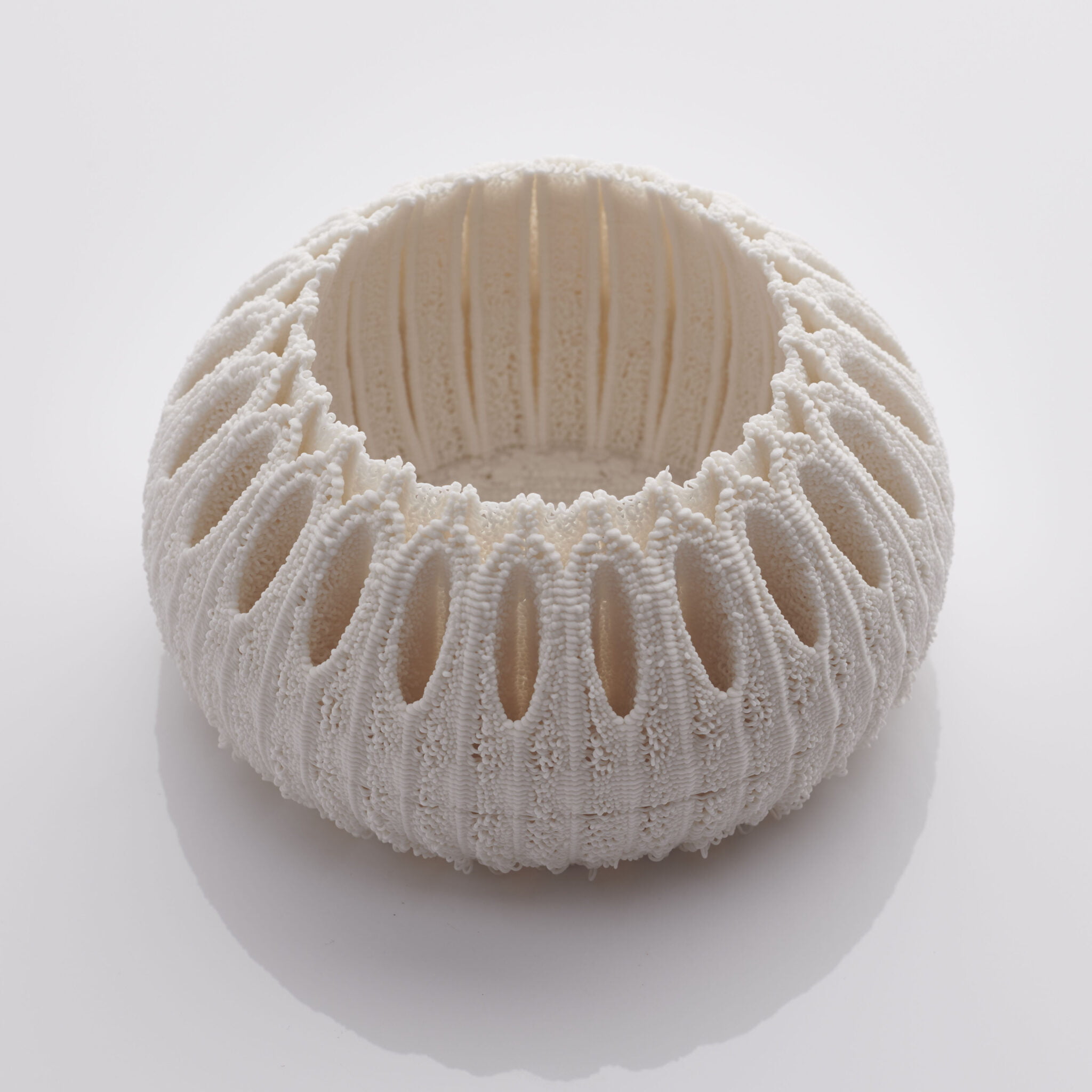
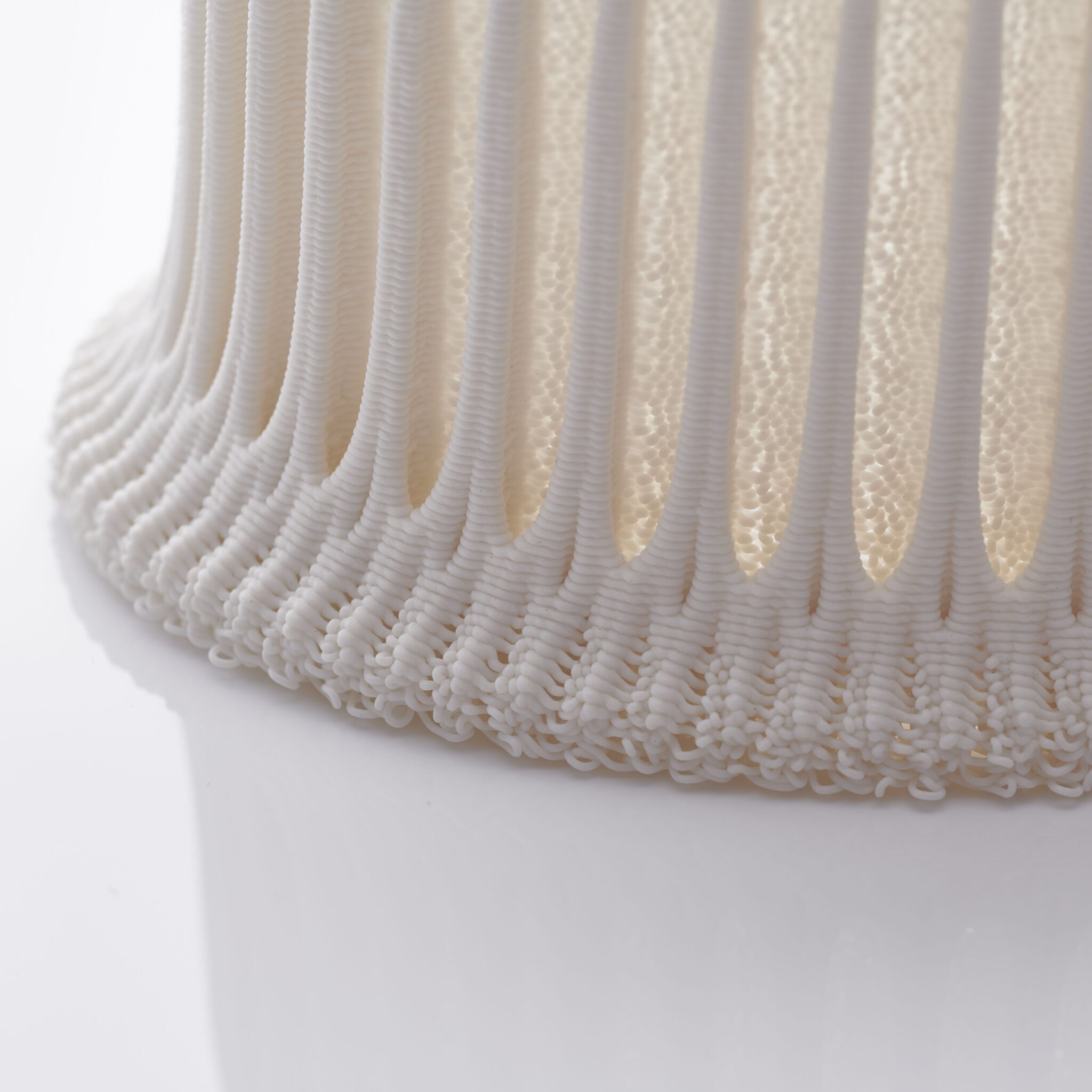
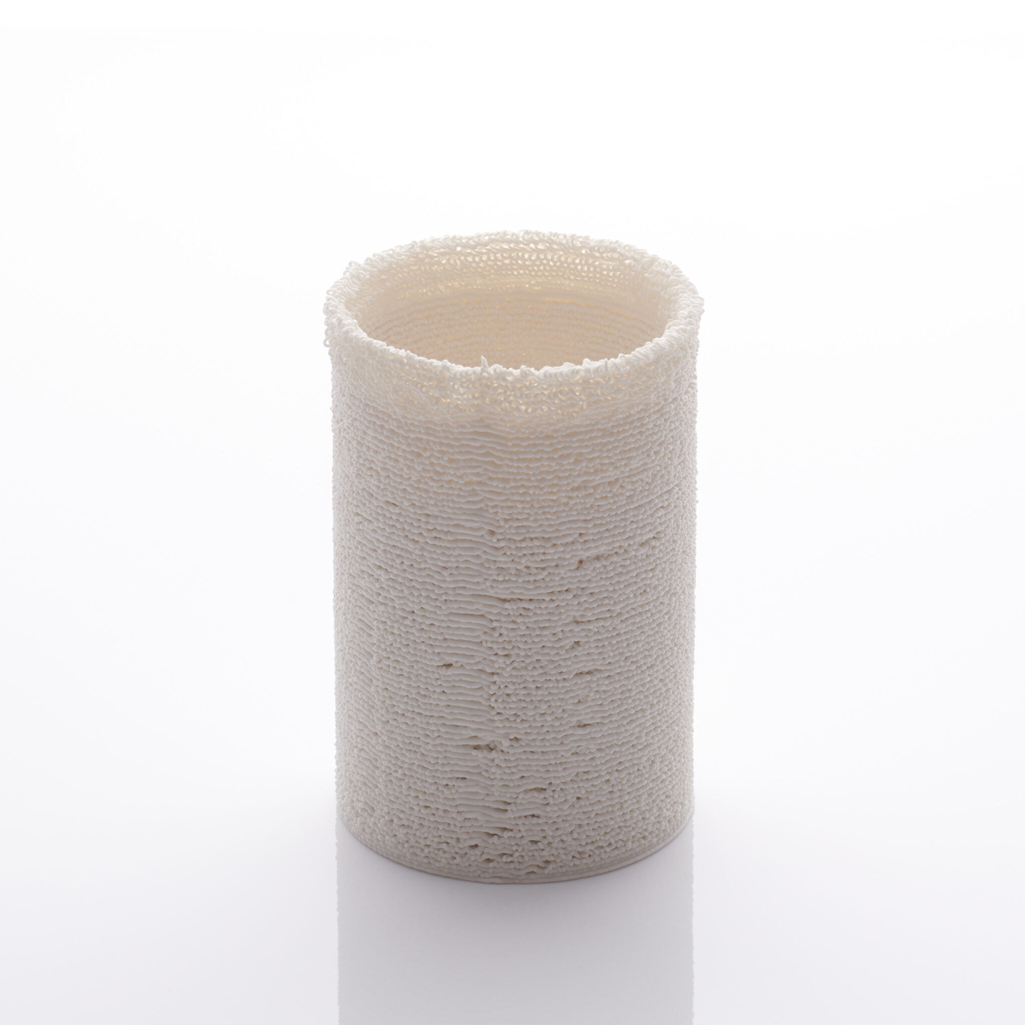
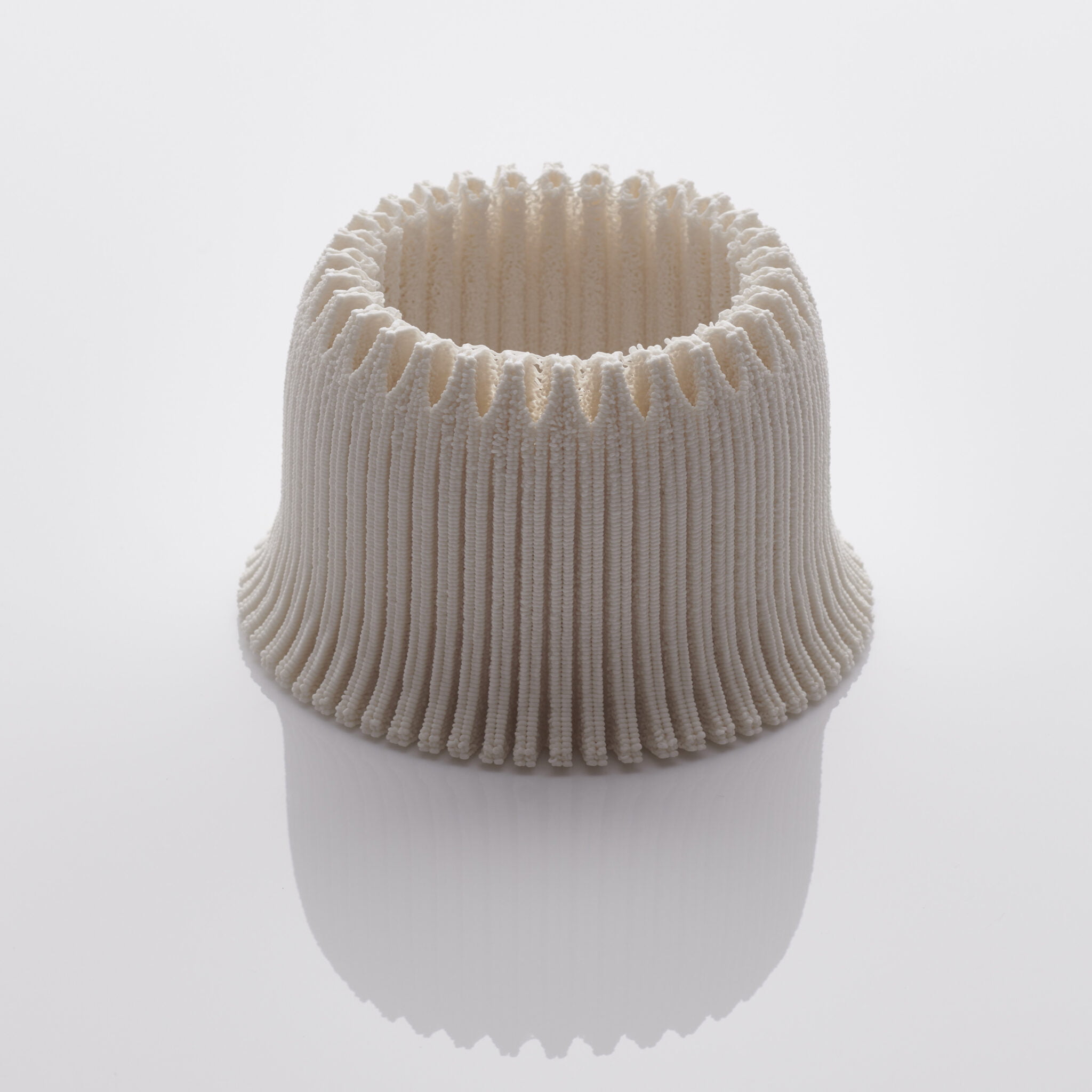
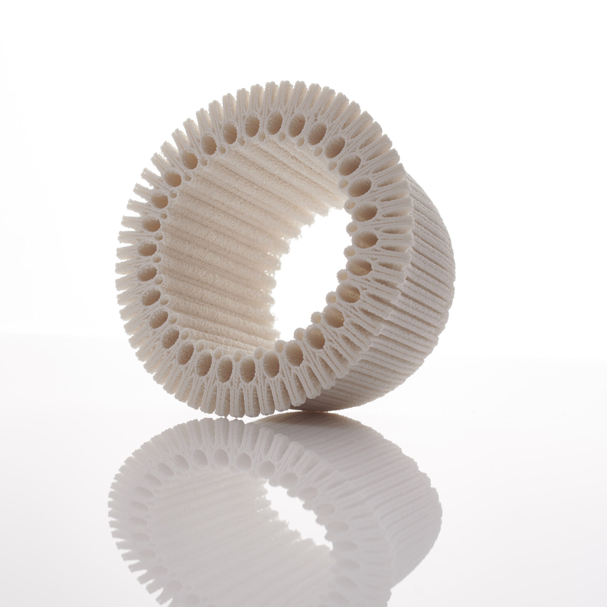
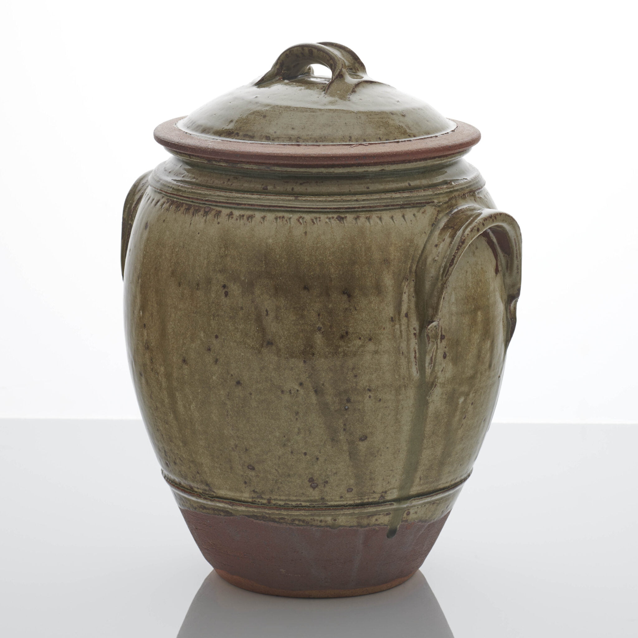
Having lived on the small island of Malta all my life meant that I was constantly surrounded by family and tradition. Moving to London has exposed me to immense resources and opportunities.
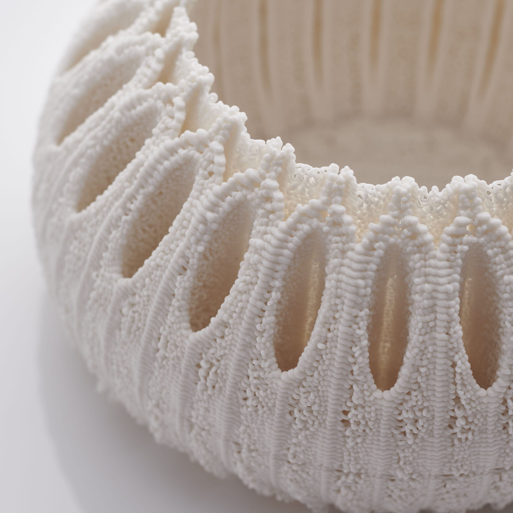
By embracing the tradition and heritage that surrounded my upbringing in Malta, I think of my work as being autobiographical at its core. Pairing humble materials like clay with the latest technologies in 3D printing is reminiscent of my journey. I tend to look at things that possess certain elegance, balance, and beauty. Maltese lace plays an important role in the development of my latest work. Strands of white thread create the most elaborate patterns.
Looking back at pictures of my mom from her wedding day always brought fond sentiments. The white lace dress with intricate white beads sewn on by my grandma’s very own hands looked beautiful in pictures and must have looked even more dazzling in real life, nostalgic of the beautiful white peacocks that I saw in public gardens as a child.
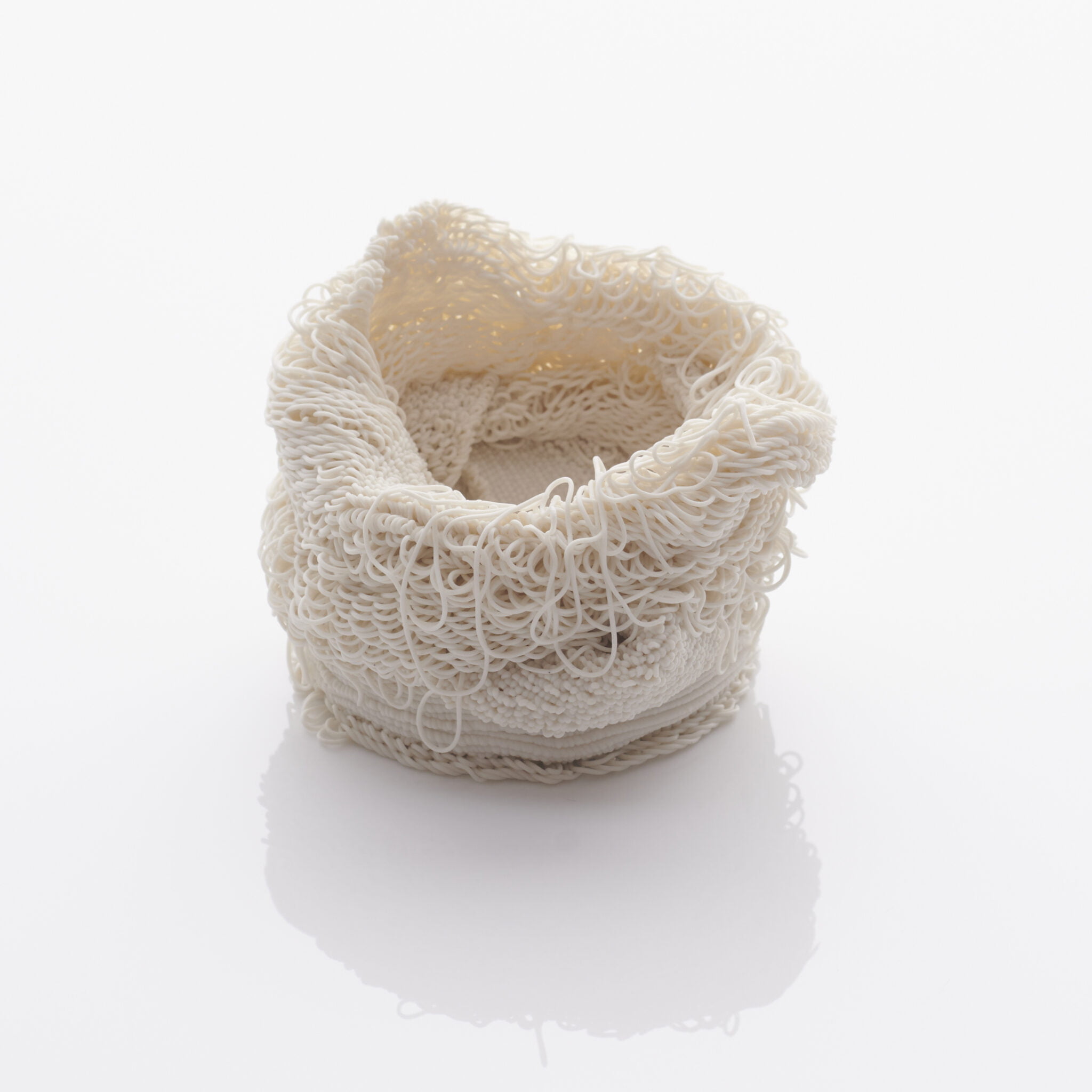
With the ever so fast advancements in technology, art and craft are affected by modern tools and machinery. I now look at clay and seek new ways of taking it to new territory. The materials used in my pieces make them solid and firm. Conflicting themes recur in my work. I strive to bind together traditional and contemporary, stability and weakness, order and chaos. Each side has a little of the other; there are no clear solid boundaries and that overlap is where I draw most of my inspiration from. My pieces give a grander impression of size, like a contained cathedral of sorts, almost monumental on a small scale.
The pieces I have chosen to show in Autoritratto are called BREATHS. They look ethereal but in fact some of them weigh up to twelve kilos. Glass is fragile but it is also very durable. At first these BREATHS look white, but look more closely and you will see they reveal a beautiful interplay of light and shadow; they glow from within the inside. This subtle effect is achieved by the light being refracted through several layers of transparent and opaline glass, and the silken finish of the surface. Forms like these can only be made by a team of highly skilled glassworkers all working together in a perfectly tuned collaboration.
We caressed each form out of hot soft glass by hand, protected only with a layer of wet paper, and by breathing in and out through the blowing pipe. We relied solely on heat, gravity, and the air in our lungs. We worked in harmony with the molten material, trying to predict its movement. More than half the pieces we made ended up broken. Some cracked as they cooled, and others were damaged in the finishing processes. Each one has been polished, sandblasted and hand-finished.
The black pieces are voluptuous; they are like velvet. I think of them as being earthly counterweights to the ethereal white pieces. For me, they are like a caressing embrace.
Glass is something we can touch and hold – but breath is not. I simply sense it. These pieces were made using these two constituents – glass and breath – and nothing more. We breathe while we are alive, but these BREATHS will last for generations to come. Their quiet presence invites us to lose ourselves in meditative reflection and contemplative
silence.
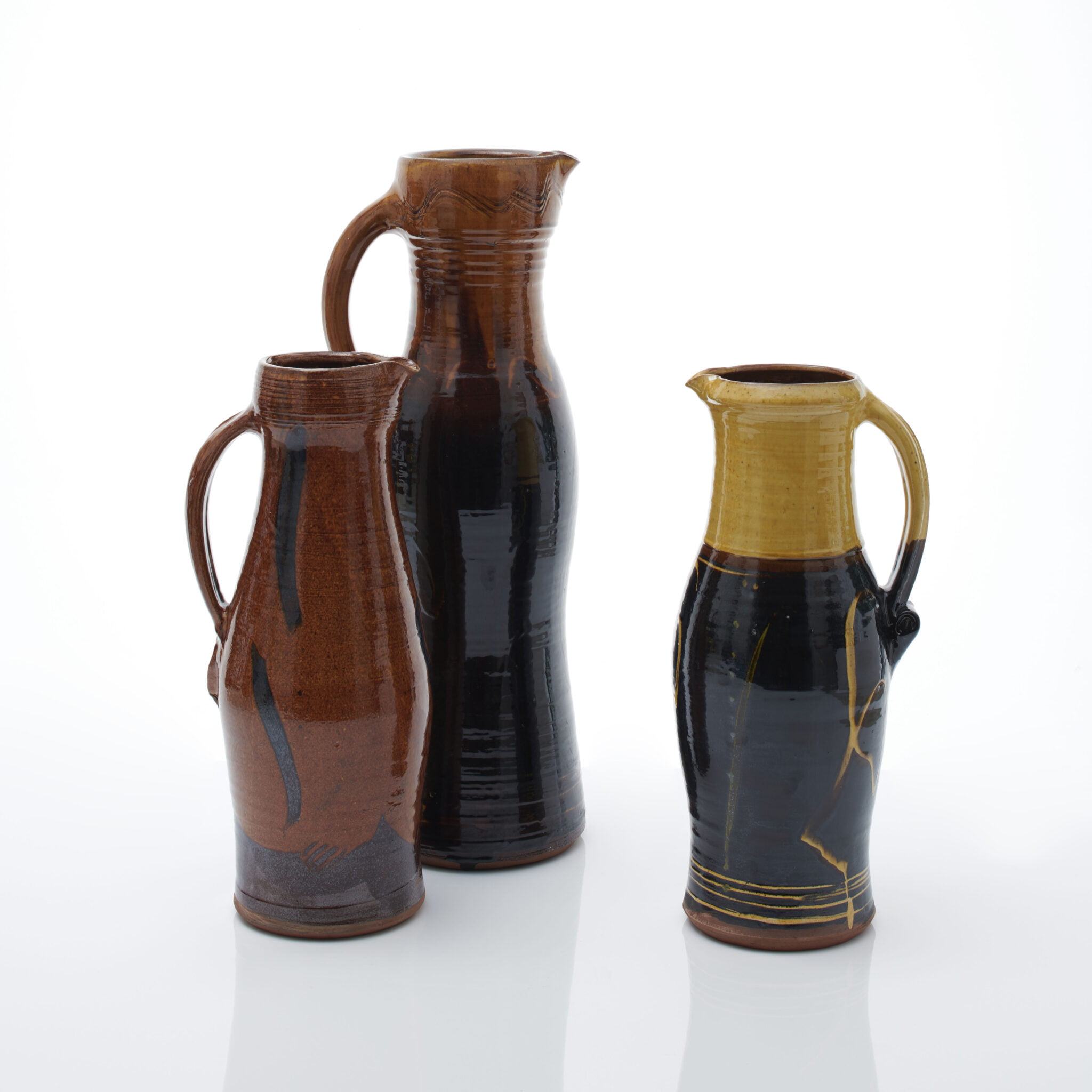
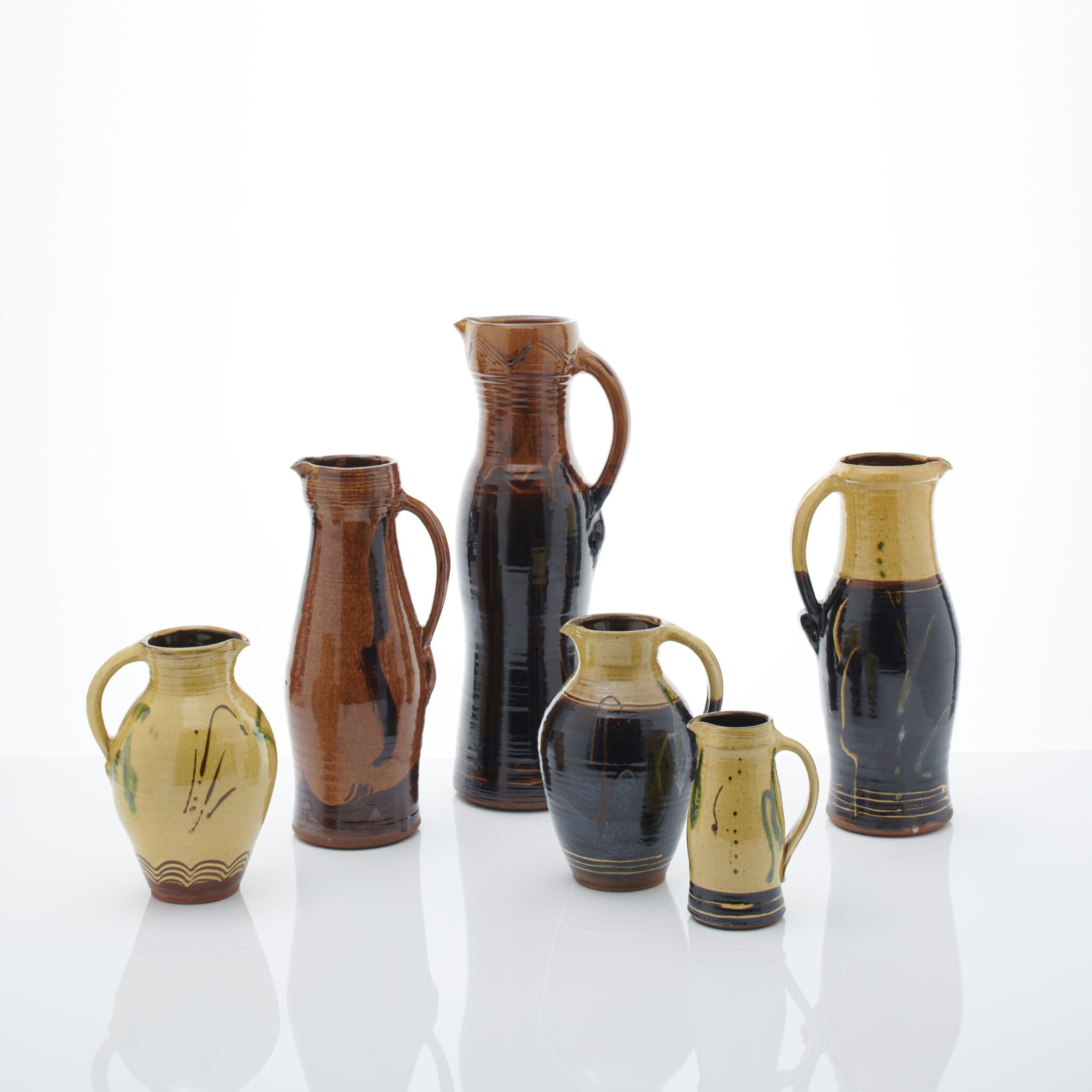
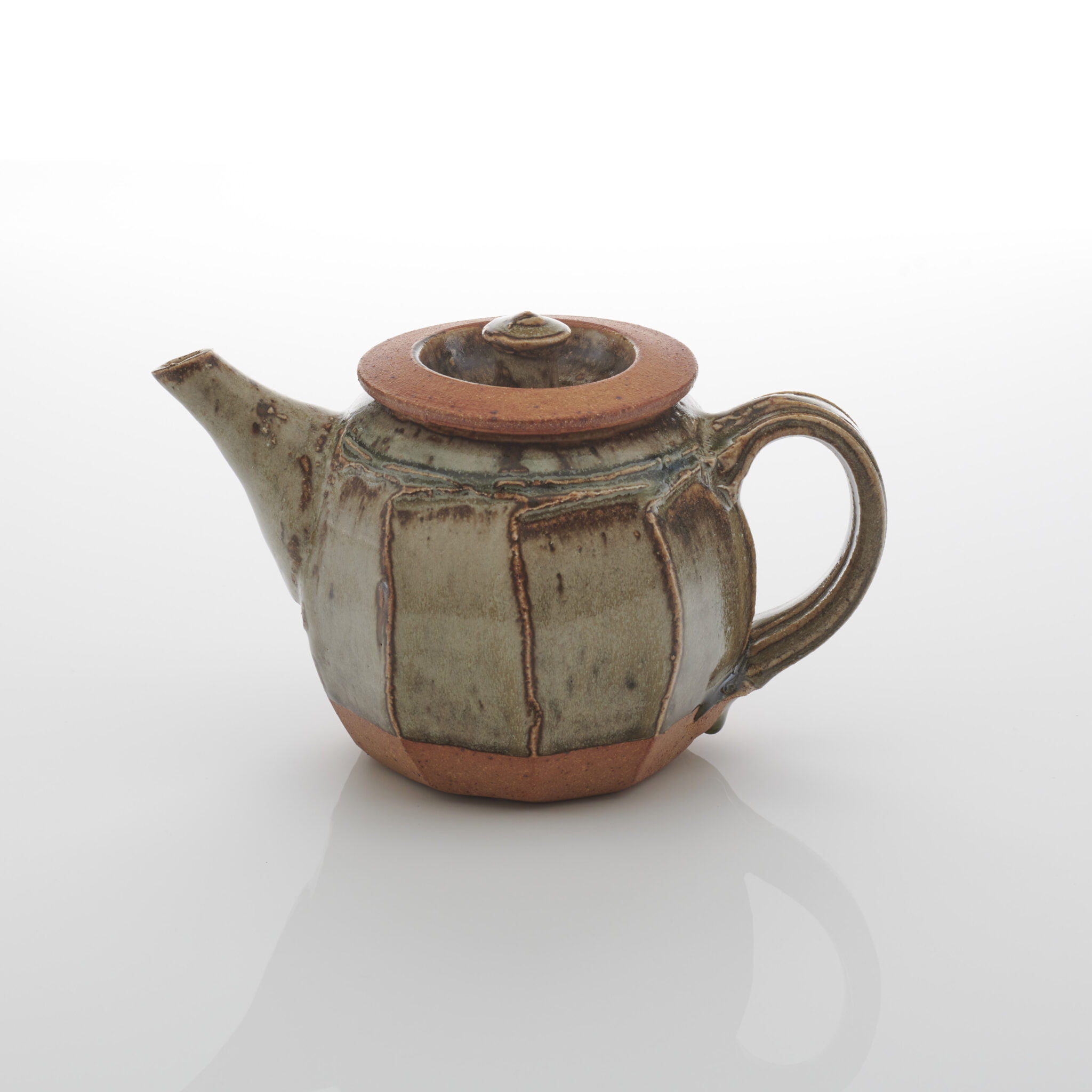
The jug is the form to which I always return. It was my starting point and continues to be my touchstone. There is no hiding place, no room for bad throwing. As Michael Cardew wrote, There is no margin for any dead weight of inactive material, nor for any feature which is not in some way functional. It sums up what pottery is about; everything has to be in balance; the height, the swell of the belly, the spring of the handle, if it isn’t, you’ve just made a bad pot. And, of course it has
to pour cleanly, without dribbling.
I started my career looking at and trying to match up to the traditional North Devon round harvest jug. Fifty years ago I spent a year as a production thrower at Brannams pottery factory, producing over 100 jugs a day. Somewhere along the line while there I was able to ‘lose my tail’ as Soetsu Yanagi described it – in other words to let my making become unconscious rather than self-conscious, effortless rather than effortful . . . and to quote Cardew again, Throwers have to apply the same standards in their performance as musicians do in theirs. Put simply, you have to practise your scales every day. Jugs have definitely been my scales over the years.
Increasingly, as well as the round jug, I became fascinated by the English mediaeval jug forms made from the 12th century. Their many subtleties of form and possibilities for slip decoration have been irresistible. For me the decoration always has to be integral to the pot – not just some surface twiddles applied without consideration for the form underneath . . . I always return to the jug as the core of my working practice.
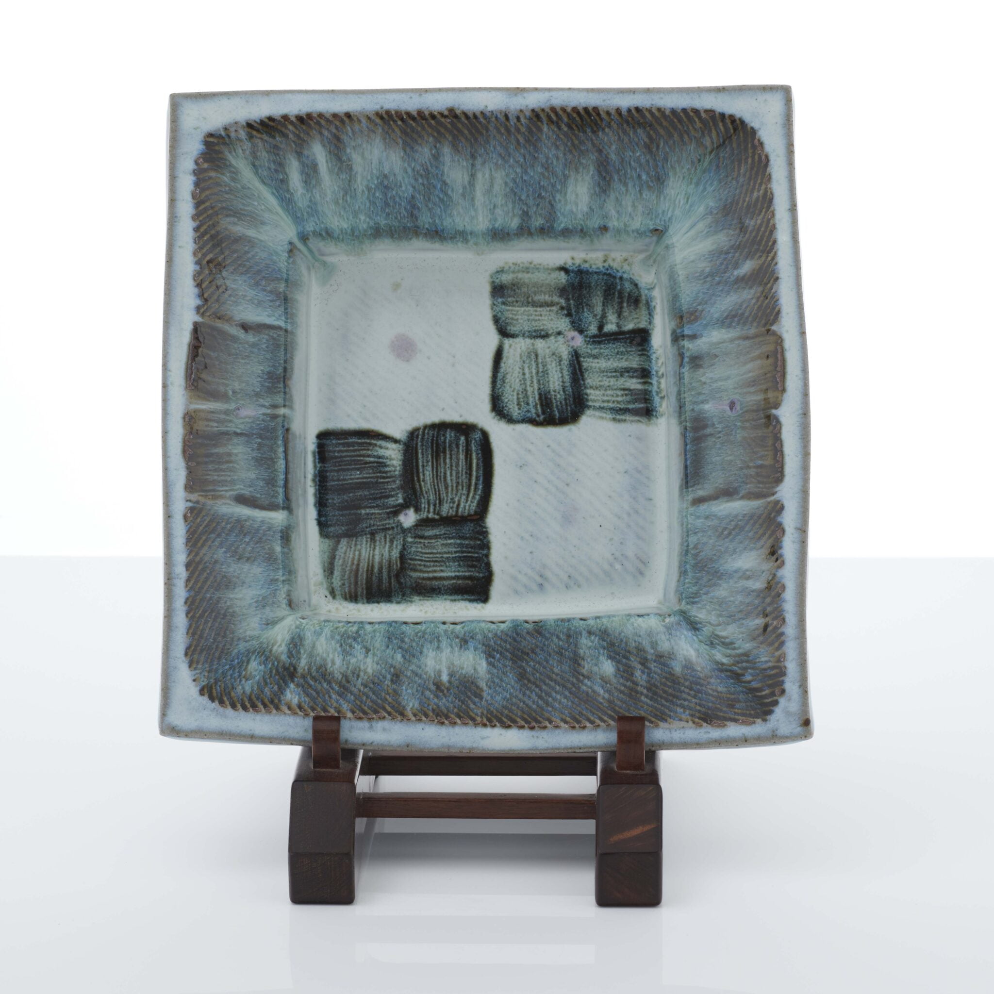
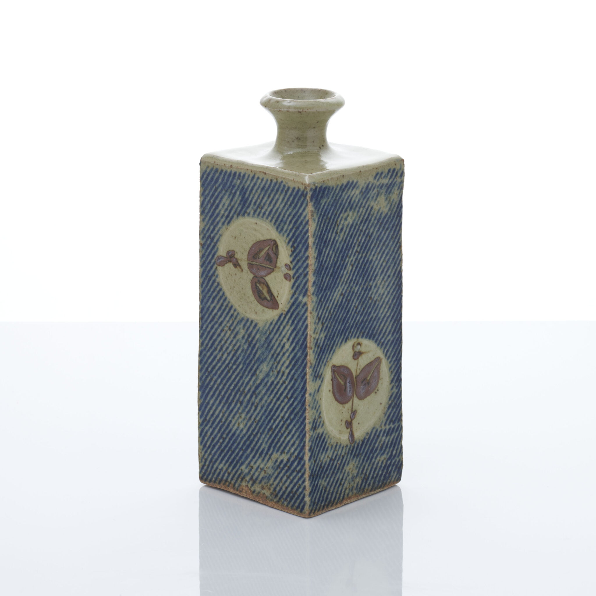
The press moulded plate and the square bottle have been a constant in my career as a potter. These two shapes invite you to decorate what appears to be a simple surface. The process of making involves two people, myself and a mould maker working closely together. These two shapes take me straight back to Mashiko, where tottering piles of plaster moulds were stacked under the workshop eves to dry. At Shimaoka Sensei’s workshop the press moulded pieces were only made by the workshop manager, and great care was taken in attending to the edges and seams. He made it look easy, but as I found out when I attempted to make my own models, it was far from simple.
On my return from Japan I began making models for a press moulded square bottle and plate, and by a stroke of luck I found a mould maker near to my home in Penrith. He was a skilled craftsman and took great pride in his work. The moulds were beautiful, the notches all in the right place, and after thirty years I am still using them today.
The making of press moulded plates and bottles starts my year, when days are short and cold. The square bottle belies a simplicity in its creation. After assembling the four individual pieces I am presented with blank surfaces; the four facets lend themselves to a multitude of decorative ideas but only one can be used, and the edges demand very careful attention.
For me, the square bottle represents the ultimate simplicity of form. It combines the circle and square. Together with quiet decoration, it conveys the optimum balance I strive for in my work. Such bottles are the epitome of technical ability and thoughtful design.

This is a personal statement written by Joanna Bird in 2020. Richard is no longer making pots, and he was unable to respond to the invitation to write about his work for Autoritratto. Joanna has known him for over forty years, and their close friendship continues to this day.*
For the last sixty-three years, Richard’s life has been consecrated to making pots. Four distinct forms have been chosen for Autoritratto, and there is a sense in which these forms represent his life’s work: the cut-sided bowl, the beer jar, the caddy, and the tazza. (This last form, a pedestal cup, was first called a tazza by George Wingfield Digby – the eminent collector of ceramics. Richard liked the term and it stuck.)
Each of these forms has evolved over the decades. Richard lives with the pots he makes, using them in his everyday life, looking at them, reassessing them, and constantly refining them. He and his wife Dinah used his pots to make beer and wine with the fruits from their garden: gooseberry, apple, and loganberry. His forms have developed over the years, and he adjusts each form until it serves its purpose to his complete satisfaction. It must be perfectly resolved – both for the hand’s use, and for the eye’s pleasure. Richard drew an important aesthetic distinction between the transient allure of machine-made, mass-produced ‘fashionable’ objects (such as he saw being sold to the unwary in the colour supplements) and individual handmade pieces whose virtues transcend time. He waited for people to find him and discover the quality of his work. Once they had done so, and had chosen to live with his pots, they remained loyal to the aesthetic integrity that each of his pots so magnificently embodies.
* Richard’s way of life as a potter, and his skill in working clay with the simplest of tools – such as the decorator’s scraper that he used to make one of his iconic forms, the cut-sided bowl – can be seen in Richard Batterham, Master Potter, a video made by the Joanna Bird Foundation in 2017.


I was busy making. Increasing the size of my vessels. Building up stock and working on a commission when I was invited to take part in Autoritratto. Because of the pandemic I was alternating time at the studio with time at home, at the studio exploring ideas, at home thinking and researching words to feed this project. Words that in one way or another describe aspects of me or my personality. Things that I like, seek or are essential to me.
Opposites and contradictory words seem to get along. This multiplicity of meanings and qualities helped to guide me towards the piece I wanted to create. First considering the material, then form and function.
It occurred to me that the material should not be pure porcelain; I am a Brazilian of Italian and Portuguese descent living the the UK; it didn’t seem quite right. Thinking further about it, maybe a clay body that is made by combining materials, still holding qualities such as quietness, serenity, hardness and warmth.
When it came to form, I asked myself:
Should it be an open vessel, a container that holds or supports?
Should it be for food to represent caring and nurturing, or perhaps for flowers to represent beauty?
A piece that provides space or a frame?
Functional? Yes, but not essential.
Layered or assembled?
Slowly the concept started to take shape. Numerous forms could have worked and there were endless possibilities but that again is who I am.
Then a new thought: that the object should be part of a family. A family of pieces made of composites and several elements, interacting with each other, complementing one another. Members of the same family but also perhaps facets of the same person.
This idea continued to unfold until I thought of the word:
Reflection.
Reflect seems a crucial word.
And why not a frame? Made out of clay.
Asymmetric shapes, assembled.
Giving space and focus to the viewer. Taking myself away while still being there and supporting.
The reflection could be faint, waterlike or shiny as a mirror. It could be a series, each one different, sometimes more present, sometimes more distant, almost like a memory, capturing the moment and gone the same way it came.
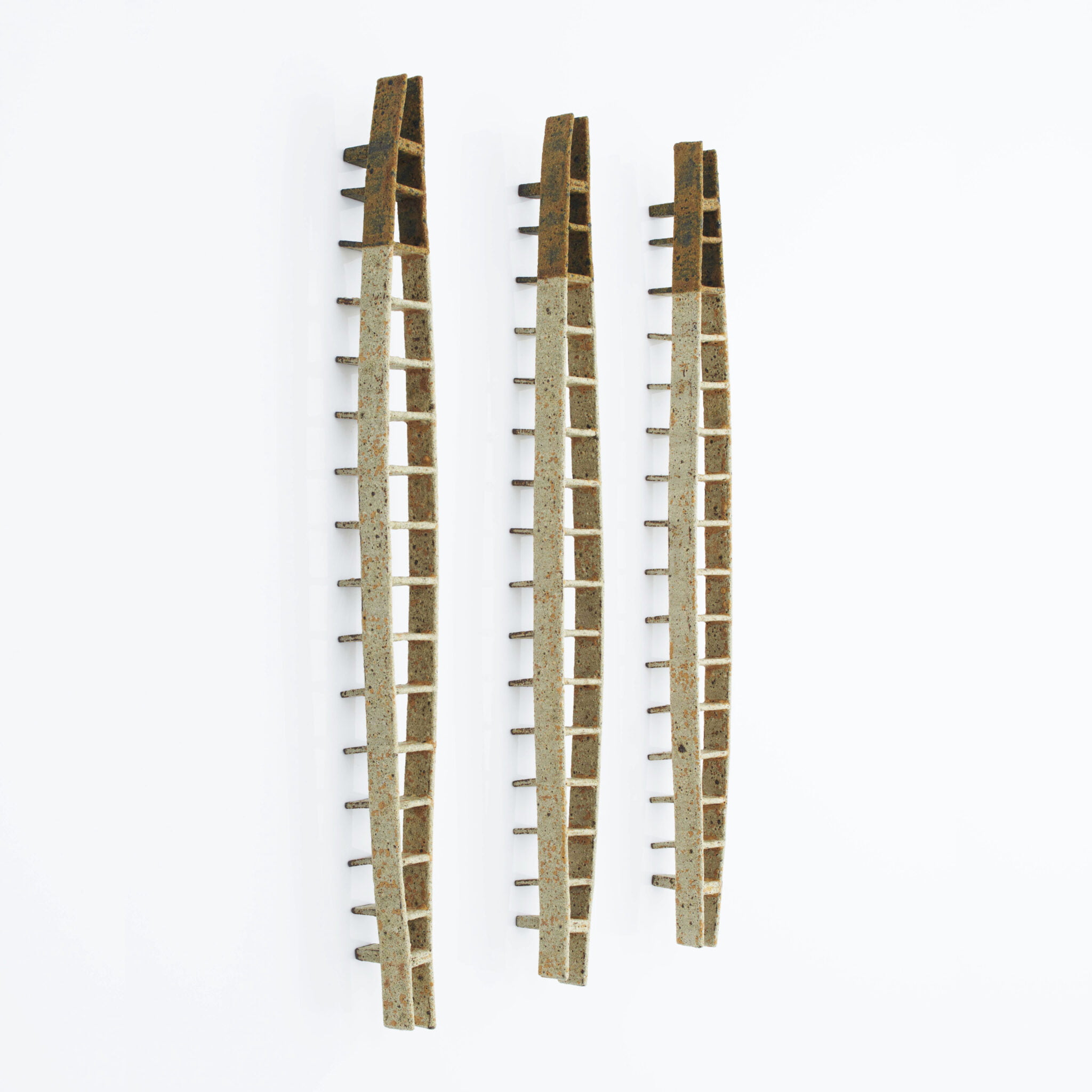
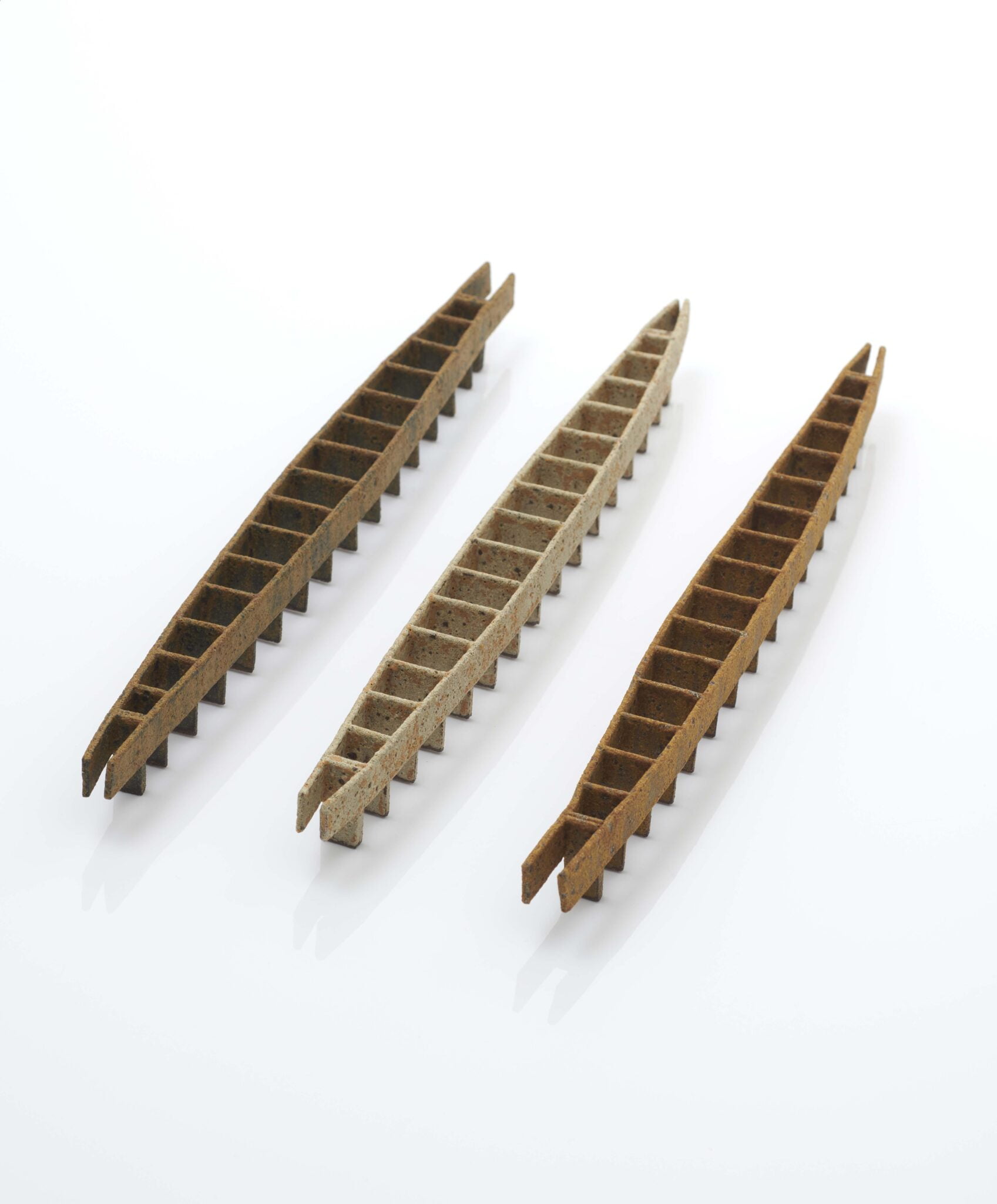
I was recently asked to describe my work in three words, and my answer was ‘Sense of Place’. Ideas for my work are drawn from the Deben, a tidal River in Suffolk, where for many generations my family have lived and worked. Fossils collected since childhood form the quality and colour palette found in my work, each colour linking back to the muddy foreshore on which it was conceived.
The tidal fragments that I collect – fossilised wood and bone, and sharks’ teeth that are thirty million years old – are highly personal things. They are fundamental to my creative responses, and to my sense of connection. The ladder-like forms suggest the archaeological objects emerging from the mud.
These structures refer to the many ladders that are found on or in the river. Viewed from the side they are suggestive of the jetties that straddle the foreshore. Their elliptical shape is boat-like, referencing the Sutton Hoo site upstream.
I use an iron-rich, red, stoneware clay to make my work, and lithium glazes. I add a variety of oxides to the glaze: yellow iron, nickel, and zirconium. The ladders forming Tideline make direct reference to the ebb and flow of the water and the marks left by the receding tides. Ladders glazed white suggest a frozen landscape, marked out in a frozen tideline echoing the continued passing of time and tide.
‘Jetty’ image by Michael Harvey

River Deben, Suffolk
Glass engravers work with light. Whether the glass is deeply engraved in several layers, or gently engraved on the surface, the effect of light is essential for the result.
Lettering and calligraphy appear best using one of the simplest of methods to engrave: to scratch or, a more accurate description, to abrade the surface. Using a revolving diamond encrusted small bur the surface is gently roughened. The abraded surface will catch the light in a different way to the smooth surface so the words are visible as a different tone. Glass, considered words and appropriate letter design can enhance each other in a way not possible in any other medium. The result can be a whole which is greater that the sum of its parts.
This above all: to thine own self be true.
The lettering style finally chosen is an upper and lower case italic. Italic gives movement. The phrase is short, therefore there is no need to break the second part of the sentence in a reverse curve below to assist reading. An italic hand however tall, slim, short of fat lends itself to flourishes; these should flow as a ribbon in a ballet sequence or be taut as a cast fishing line. With words in a circle within a square there is a temptation to fill the corners with flourishes which can be designed as a profusion of elaborate shapes – but always the words are the important aspect of the design and flourishes can detract from them. Confusion is doubled when designing for a mirror. For Autoritratto, I have chosen restraint.
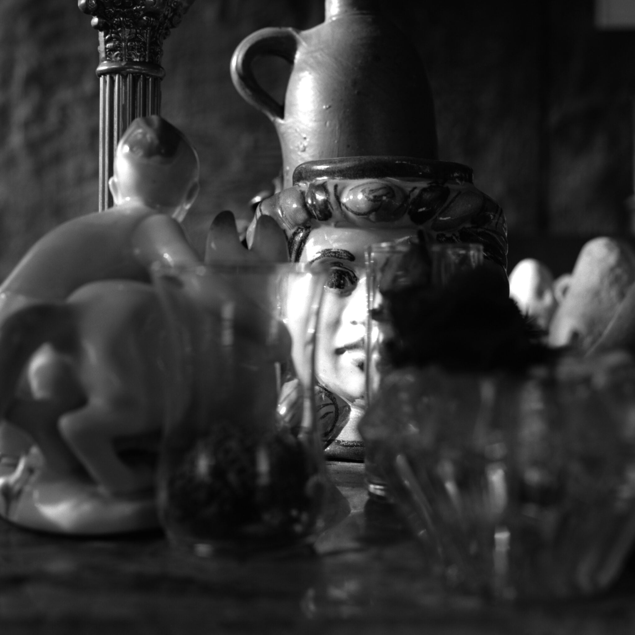
The juxtaposition of any two objects can result in them ‘speaking’ to one another in mysterious, bizarre, or even comical ways.
Once they have been placed – or re-placed – in this way, we can then ‘overhear’ a discourse between objects; a discourse that might otherwise be inaudible.
Context can be thought of as a kind of language without words – like music. And the placing of objects can articulate things very precisely – like poetry.
There are things to be said by objects if we can place them, and attend to them, in just the right way. But what we hear with the inner ear will, inevitably, be a representation of ourselves. And the ‘discourse’ that we overhear cannot help but be, in a sense, a self-portrait.


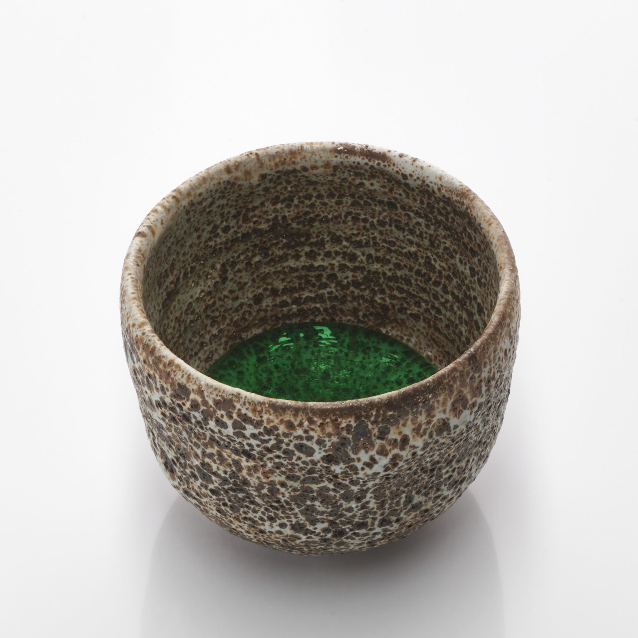
Ewen Henderson, volcanic glazed bowl, c.1985; with one green glass inclusion. Height 9cm Width 11cm
‘I called this assemblage A Nightcap for Lady Macbeth. She, I felt sure, would be sufficiently thick-skinned to put her brazen lips to its blistered surface and take a sip. The green glass globule now at the bottom of the bowl looks like a blood-curdling potion or, better still, a drop of poison such as only Lady Macbeth could possibly stomach.’
Cauldon breakfast cup, porcelain with blue transfer decoration, 20th century; with one blue glass inclusion. Height 11cm Width (including handle) 11cm
‘If it was only ever meant for display, then what can such an oversized teacup have had to recommend it? It would sit uncomfortably on the most accommodating Welsh dresser, among the blue and white soup tureens and chargers. It is, in short, a misfit in any domestic interior. It brings to mind Alice’s adventures in Wonderland; her ambivalent interactions with scale were due to sipping from a bottle marked Drink me, and eating a cake with Eat me spelt out in currants on top.’

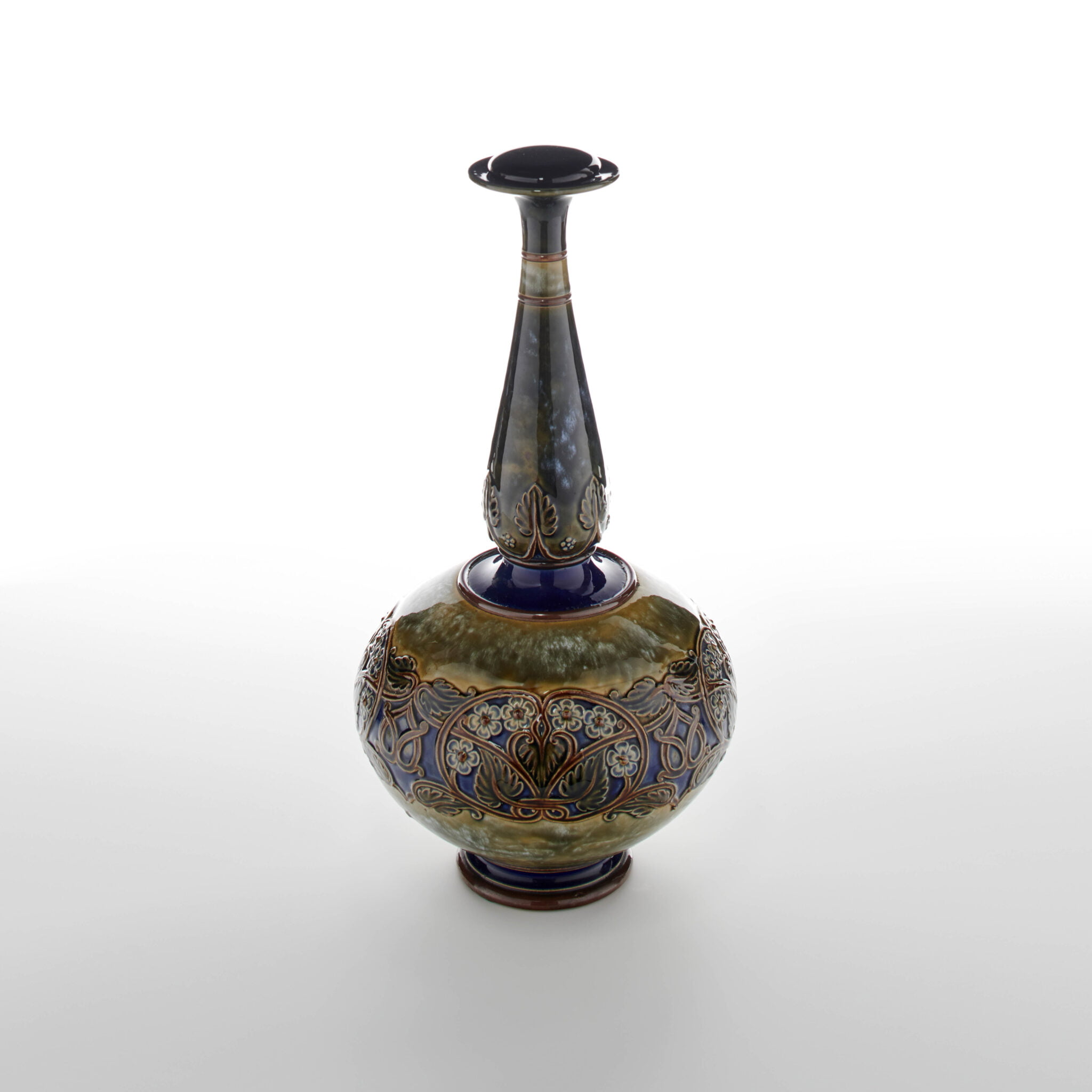
Royal Doulton vase, impressed on the base with the Royal Doulton crest and seal, together with manufacturer’s identification marks: 169 Y, and the initials LB, early 20th century; with one black glass inclusion. Height 41cm Width 18cm
‘What this vase stands for has been radically changed by the addition of the black glass drop on its lip. No longer just a decorative Arts and Crafts ornament, it can now be thought of as a conceptual piece that invites us to consider the lengths that the imagination is willing to go to in order to make sense of what the eye actually sees. It is perfectly plausible to regard this vase as being brimful and on the brink of overflowing, but the eye is likely to be engaged by the discrepancy between what it actually sees, and what it infers – especially when the imagination is in play.’
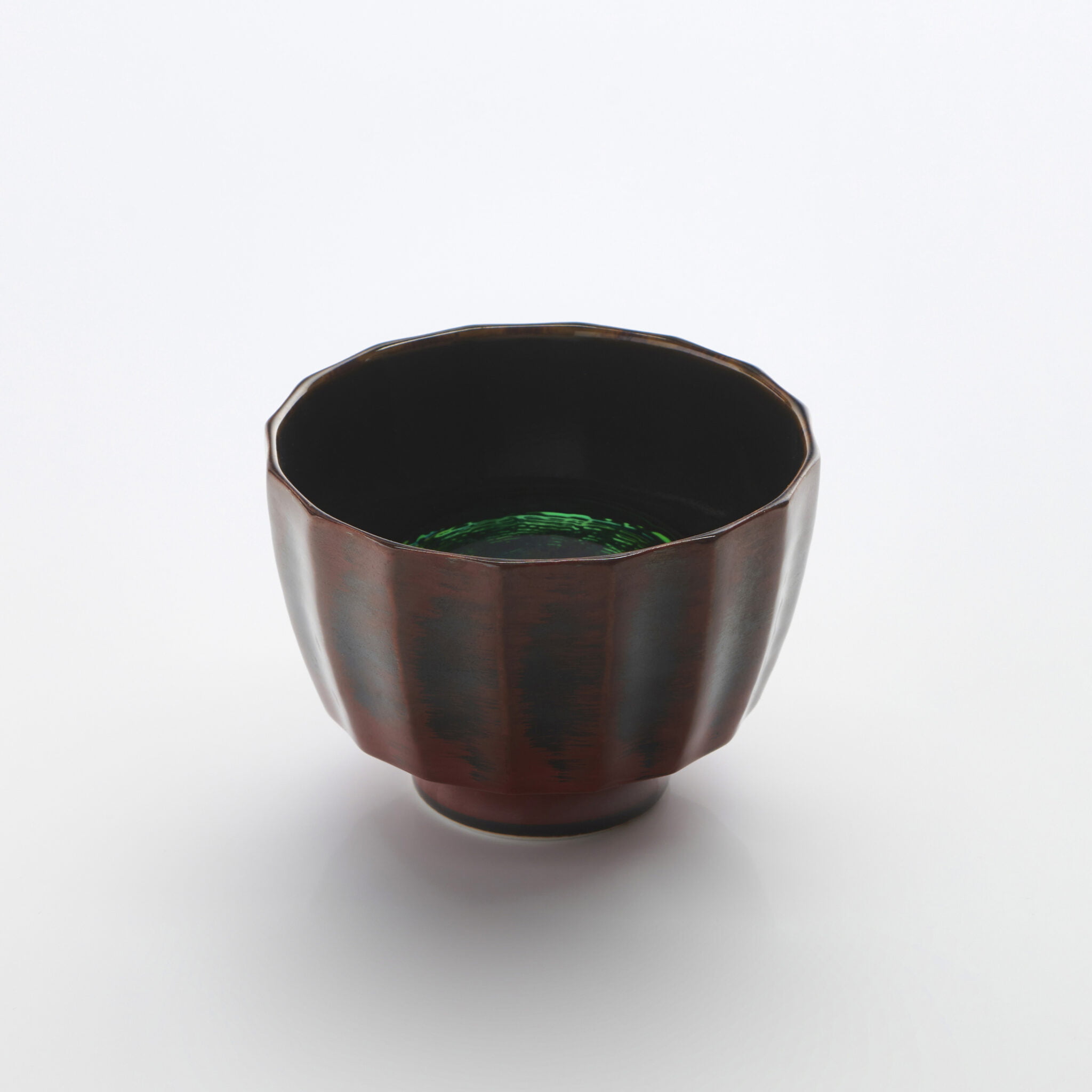
Japanese faceted bowl in imitation of worn lacquer ware, 21st century; with one green glass inclusion. Height 8cm Width 11cm
‘In Buddhist theology – as far as I understand it – the Hungry Ghosts are souls trapped in an in-between state, awaiting reincarnation. At the Zen Monastery where I have stayed, Throssel Hole Abbey, offerings are made to the Hungry Ghosts after every meal. I like to imagine that the mysterious dark green glass globule offered up in this Japanese bowl might attract the Hungry Ghosts’ curiosity – especially if turned in the hand by candlelight – though it won’t in any way alleviate their hunger pangs.’
Porcelain mug, Royal College of Art, class of 2013 student production, from the R.C.A. Diploma Show 2013; with two black glass inclusions, one inside the mug, and one beside it. Height 11cm Width (mug only, including handle) 11cm
‘So, what do we think has been going on here? I like to imagine that these pieces are all that remains of a dating-agency rendezvous – one that didn’t go nearly as well as had been hoped. Both adults realise what has gone wrong, but the realisation hits them only as they are leaving the coffee house to resume their separate lives. What they are aching to say to one another now constitutes, all too poignantly, a late flowering of l’esprit de l’escalier.’

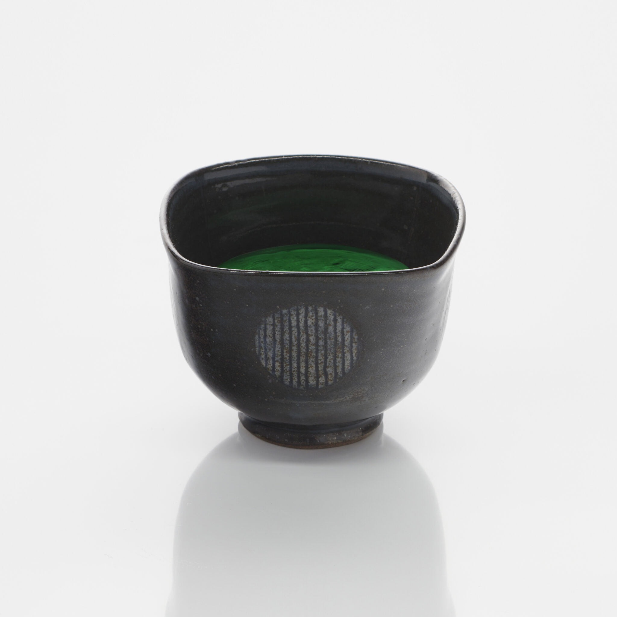
Karen Bunting, squared tea bowl on a round foot, stoneware, c.2015; with one green glass inclusion. Height 8cm Width 10cm
‘‘Bunting’ is a particularly felicitous word meaning both ‘a display of small festive flags’ and ‘a small brown finch’. In North America the word describes a number of species of songbird, including the indigo bunting and the painted bunting. The latter has a violet head, red body and green back, and is the most vividly coloured of all the North American songbirds. Miss Bunting’s Tonic may well be the most vividly coloured tonic I’ve ever come across, even if Night Nurse does come a close second.’
These five pieces, collectively called ENTICEMENTS, were made for the joy of it – pure and simple.
Thinking about oneself seems to be a rather daunting prospect to someone of my temperament. However, being asked to take part in this exhibition has made me reflect. It came clear to me that, like most people, work results from unrelated and seemingly irrelevant events.
My work depicts movement. Undulation and motion have always been part of my life, starting with growing up surrounded by the Angus landscape and hills, wildlife included. However, being at a primary school where the girls were taught French in the morning and embroidery in the afternoon (and little else) is not so evident. Nor is the extended break from the studio in order to see the National Trust take on the house of my late partner, Khadambi Asalache.
It turns out these events are pivotal to what I do now. Having not touched a needle since I was twelve, I distracted myself during the National Trust era by making my own clothes. On returning to work I realised I needed to move on from making the curved willow baskets I had been producing since the 1990s and last exhibited at the Contemporary Applied Arts exhibition Urban Fields in 2007. The curves are still at the core of the work but the material and technique have changed.
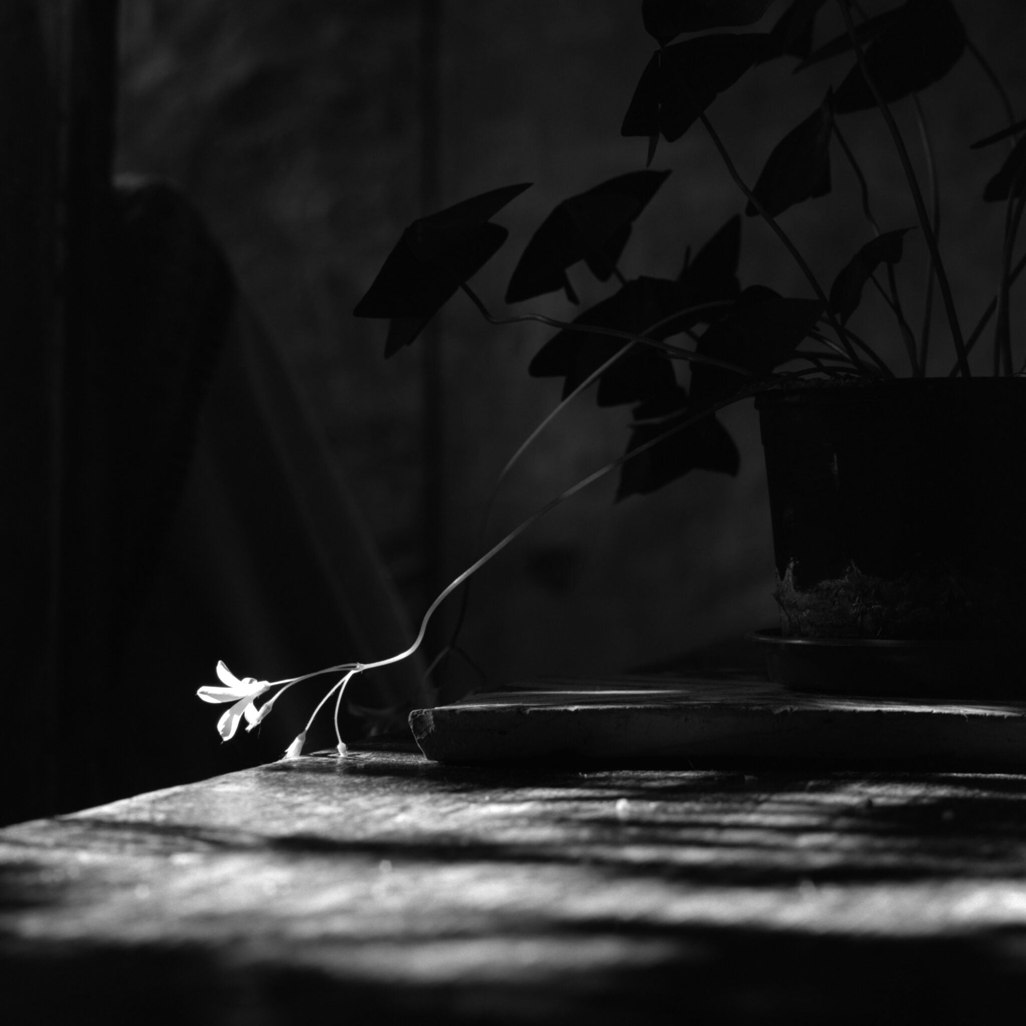
Working in my kitchen in the mornings of the 2020 spring.
All is silent. Am I silent or is the whole world?
In the darkness, you hear better, said Aristotle.
In silence and in a closed environment, can you see better?
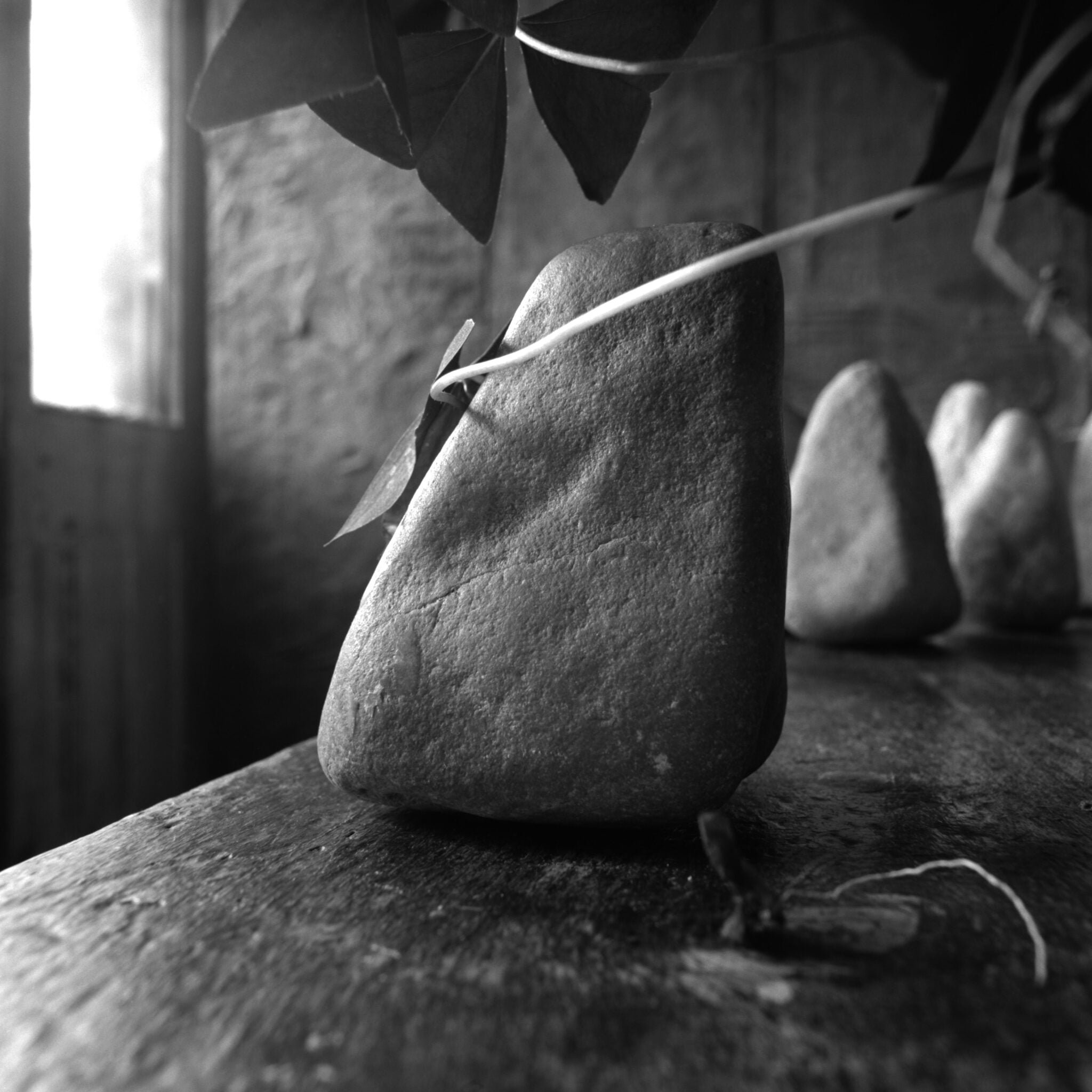
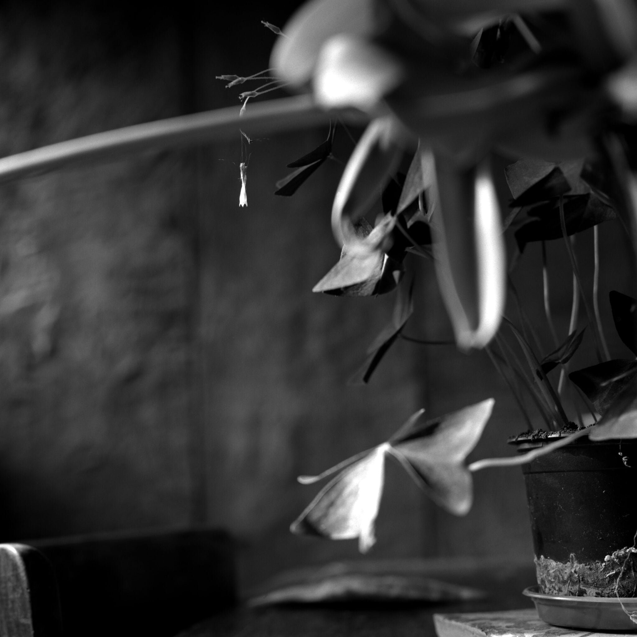
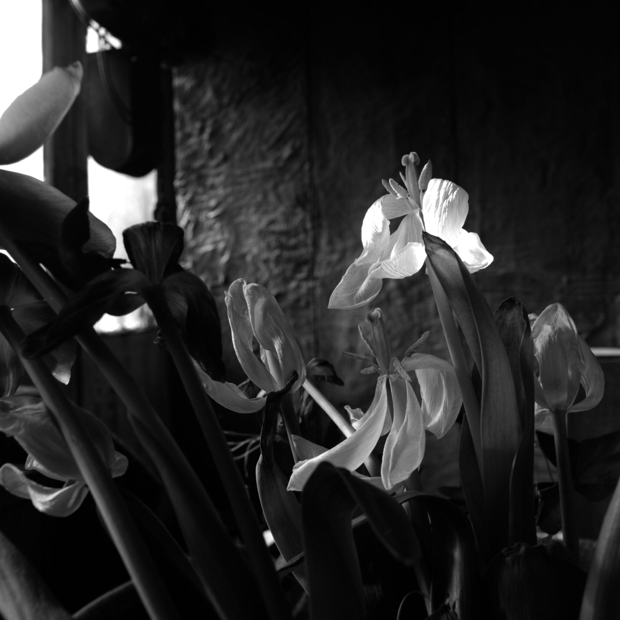
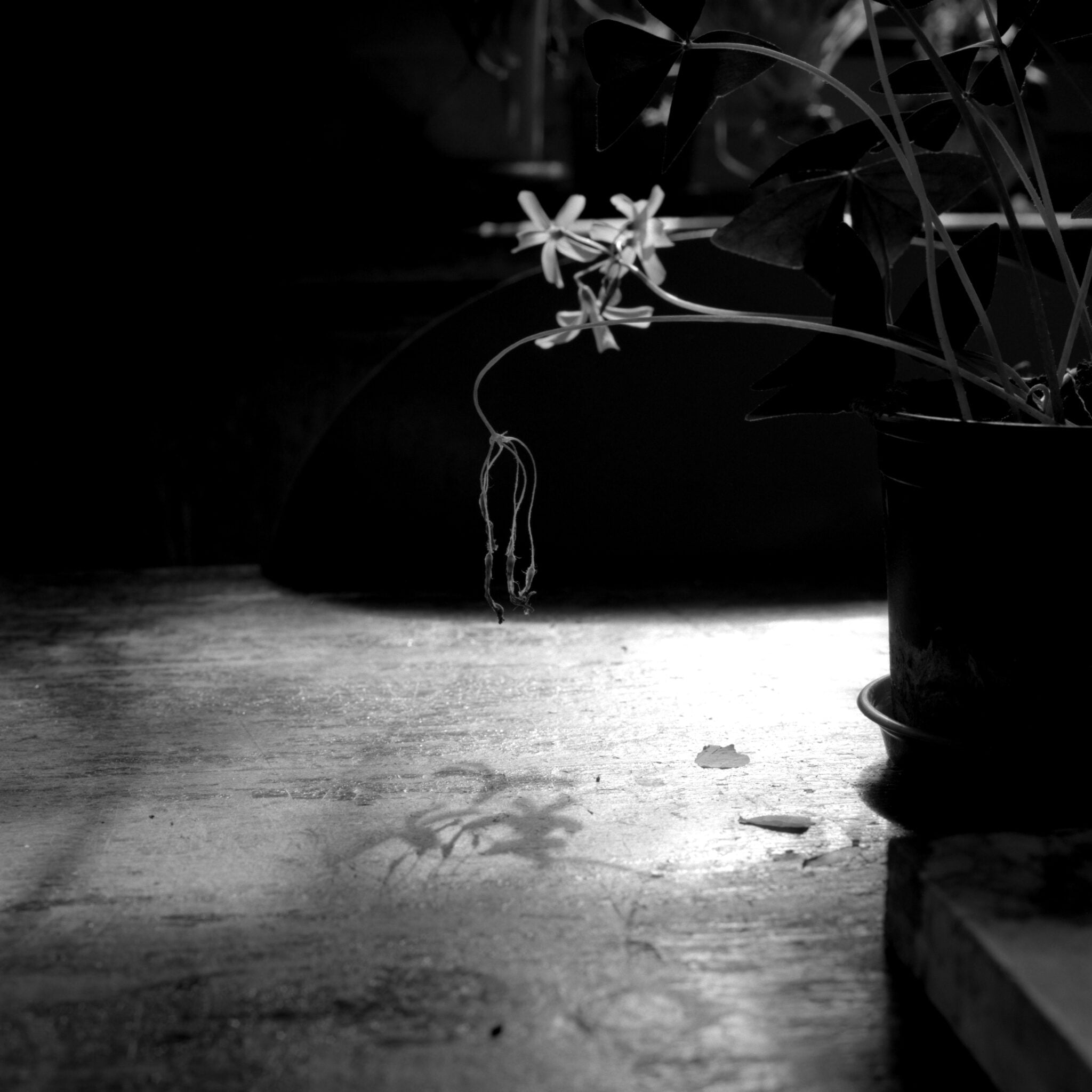
Suddenly the walls of our home have taken a different meaning and role. They completely shape our activities and for me as a photographer, they give me the palette to work with. The outsider, the rebel light, doesn’t follow the rules and comes through the walls to greet us every day. When it does so, the nostalgia for freedom is immediate. A nostalgia which as a photographer I don’t often explore. Perishing flowers, and Suiseki-like stones stand on my kitchen table. Such objects are not normally the subject of my photography which has been mostly of grandiose buildings, historical sites and the Atacama Desert. But today their invitation to be photographed is too powerful, as they tease my imagination by evoking the outside world.
Within the photographs that I took, the inhabitants of my kitchen table interact with one another, and in doing so remind us of our desire to be loved and comforted and also of our fragility. The closeness of everything, in these confined spaces, led me to work with a small depth of field and a tight framing. This allowed me to work intimately with the smallest of objects and usually unnoticed details. I hope that this way of working will stay with me as a new way of looking at the world.
When the founder of Mingei (Folk Art) movement Soetsu Yanagi saw one of the Japanese National Treasure teabowls called Kizaemon Chawan he thought, “Is that it?”
It was rather kind of disappointment than his expected feeling of sublime. Yes, it is a very humble, apparently, nothing special brown/beige bowl with cracks, partly glaze were peeled dirty bowl. In fact, it was made as a peasant bowl for everyday use by anonymous potter. It was probably brought from Korea for the order of a tea-master of Japanese tea ceremony.
Although the first meeting of Kizaemon and Mr. Yanagi was disappointment, Yanagi’s appreciation toward the bowl grew gradually. He become to be able to see “something” in it. ‘Is that it?” had become “This is it!”
My exploration of pottery began to find this Yanagi perception of “something” within Kizaemon Chawan. Though I grow up in the culture of humble virtue, I have never attracted to something vigorously selfassertive. Even though one of my signature piece called “Moon Jar” is very decorative and apparently quite extreme, I try to make it as if it happen by accident, just like “it happened” rather than “I did it”.
Therefore my Autoritratto are teabowls in this exhibition. They are drinking vessels with no handles, spout or any kind of additional features. They are bowls for drinking. There is nothing novel about it. I am making 6 teabowls with various combination of raw materials. Major technique that I am using is my favourite decoration technique called Kohiki – stone temperature fired white slipware with dark clay body. The pieces are fired in a reduction firing, which makes the white slip more translucent and shows how the white slip was applied. The reduction process also enhances the impurities of the clay come through the slipped surface. Iron speckle appears and glaze react to the body’s mineral and metals and gives subtle colour to the glaze. The heat and the stress of chemical change in the process imitate the nature of aging, showing the flow of “time”, so the view of the teabowls are something familiar to us as it is nature’s work we see commonly in our everyday life, like the weathered brick walls, change of the colour of leaves, lights and shadows. We just not pay much attention to it and not realise
how we are familiar with these features within some objects. I also believe that there are things in common between animate and inanimate things, feeling supposed to be a unique in human being but it is still created by inanimate phenomenon. I think psychologist Carl Jung’s “collective consciousness” is including the consciousness (perhaps we do not call it as consciousness) of inanimate objects.
I do make the object but let it happen by itself.
This is my portrait as it reflect how I see the world around me. Probably it is more like inside out portrait of myself.

This exhibition has given me the opportunity to focus my thinking on the nature of time. My sense of self has been brought into sharp focus, with an awareness that my past, present and future have for the moment been compressed, with time feeling more like a state of suspension. I think it’s impossible not to think about time at the moment, but it’s the conscious need not to drift, even when we’ve been un-moored by the Covid-19 pandemic. What feels vital is the need to develop an inner balance to sustain mobility of mind and creative practice.
This exploration has enabled me to take an idea in a direction that has for a long time been in plain sight, but without my understanding its critical importance to my creative bearing.
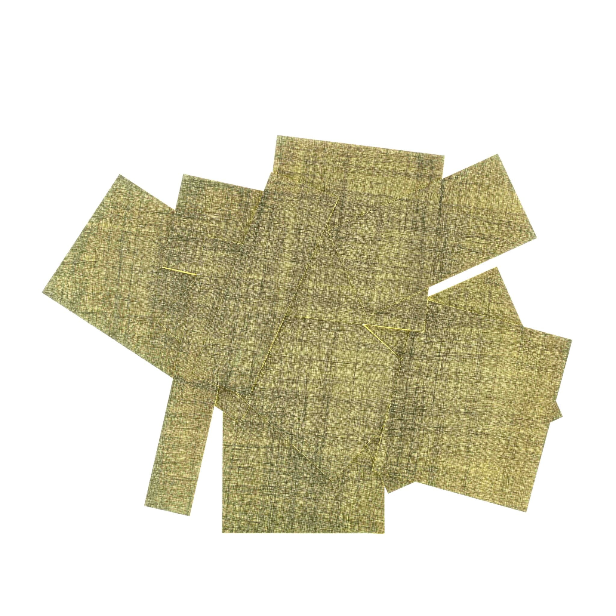
The knowledge and skill I have gathered as an artist and bookbinder have combined to form a very particular direction of travel in my practice. At the core is drawing and the exploration of mark-making: how spontaneity can be expressed through a non-gestural process such as gold tooling on leather, or how a work resonates conceptually by altering how a material, such as graphite, is used. This knowledge and experience had become a thing in itself, just waiting to be used, to explore how I might make objects that evolve in a more intuitive way.
This wall-based work, Each day is different, explores mark-making as surface: a grid flows over and across the separate and overlapping planes, creating the appearance of a unified whole, with the mesh-like grid forming a covering of sorts. These visual elements aim to align with my displacement through circumstance and the re-gathering of self.
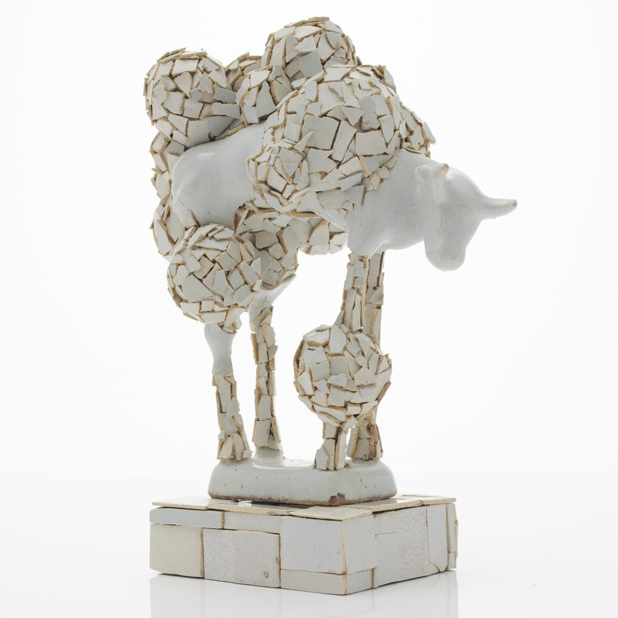
Of all ceramics, white Delft is my greatest love. It’s the only ceramic I collect. I have made a collection of one hundred white Delft functional pieces into a wall installation; this was inspired by the amazing porcelain room Daniel Marot made for William and Mary in the late 17th century. I love the domesticity of white Delft; its crudeness makes it sophisticated. It was used on a daily basis by my fellow Dutch men and women during the 17th and 18th centuries.
The little white Delft cow used in my piece is a very common type of white Delft. Similar examples were used in the early 18th century to advertise dairies and shops. They were made in a variety of sizes, and some were more complex than others. This one came from a dealer who regularly supplies me with broken and damaged Delft objects.
Although I sometimes start with a specific idea of what I want to
achieve, most of the time I gather broken ceramics which then sit on a shelf; sometimes they get used quickly, sometimes they sit around for years. The reason for this is that I wait for the object to suggest what I should be doing with it, and I let the idea develop itself. Intuitively. I often look back and wonder where that idea came from. Sometimes it works and sometimes it doesn’t, but often the failures lead to something new. I find this process hugely enjoyable.
Having caught up with a lot of work I needed to do during lockdown, I allowed myself to be playful in creating this piece. It has given me a new starting point, and struck a chord in relation to my personal heritage. I realise that the country I love to live in, and the aesthetics which I grew up with and still hold in the highest regard, are inextricably bound together.
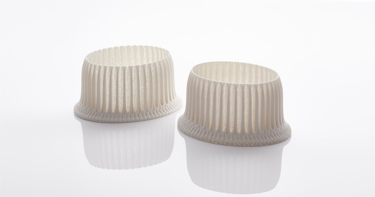
I am interested in what our eyes cannot see. The unfamiliar familiarity of these objects comes from recontextualising what I have known to be real.
The continuing theme of time runs through my practice. It acts as a gateway, allowing me to investigate the materiality of the intangible – beauty that exists without depending on the physical world. I have worked with a spectrum of everyday ‘actors’ such as tableware, insects and candelabra; each portrays a moment in time, as if through the eye of the intangible.
Cross-fire is a body of work that examines the insubstantial characteristics of the spoken word, and investigates the unseen effect of sound on the objects within an inhabited environment. The project is focussed around the context of a domestic argument, in this case an audio excerpt from the 1999 Sam Mendes film, American Beauty. The crossfire of the argument traverses the dining table, but where previously the inanimate everyday objects – plates, glasses, teapot, cutlery, jug – were
unable to express their character, the intensity of the argument deforms their once static existence into objects of a different kind. They become animated in an unexpected way, and yet retain their familiarity.
The jug exhibited in Autoritratto is an integral part of my practice, and marks a turning point in my development. Each edition of the jug has been hand-sculpted through lamp-working in glass, referencing a 3D printed master. Each undulation and deformation becomes a physical echo of the conversation.
We all have things which we think of as precious. Physical ones and ones to do with memory. And all these precious things we try to protect. Walls and shadows for religious offerings, for memories of the past. Time erodes things, so seal them away, to be brought out at special events.
This ‘Repository’ joined an illustrious gathering of historical memory at Joanna Bird’s Marking the Line, ceramics and architecture exhibition at Sir John Soane’s Museum, itself a place of evocative wall and shadow. Rather than commemorating the great world of antiquity, this is a modern piece, smooth of line and abstract of form. But the vicissitudes of life were in the making just as much, and the piece’s quiet colours helped it affiliate with Soane’s collection.
I often think that while sculpture looks out at the viewer’s world, vessels address the heavens. One of my all-time favourite buildings, from classic Soane territory, is the Pantheon, Rome. It has its famous and so rare Oculus opening upwards to the sky, nine metres wide, and allowing in both sunlight and rain and memory.
Out of the cradle, endlessly rocking
Out of the nine-month midnight
Down from the showered halo
Up from the mystic play of shadows twining and twisting as if they were alive.
Walt Whitman Leaves of Grass
first published 1855
Open 11am – 5pm, Tuesday – Friday
Appointments welcome, please call +44 (0) 208 995 9960 or email to arrange.
All images by Sylvain Deleu, unless stated otherwise.